As access to high-quality data becomes more common, more team members across the business organization are facing the challenge and opportunity to make more data-driven decisions. From traditional spreadsheet and data visualization or data viz (DV) tools to dashboard aggregators, many tools exist to help Financial Planning and Analysis (FP&A) professionals find meaning in their data.
DV tools that present a queryable visual interface offer a new approach to data analysis, allowing FP&A pros to explore data and discover patterns without waiting for data scientists to run custom queries.
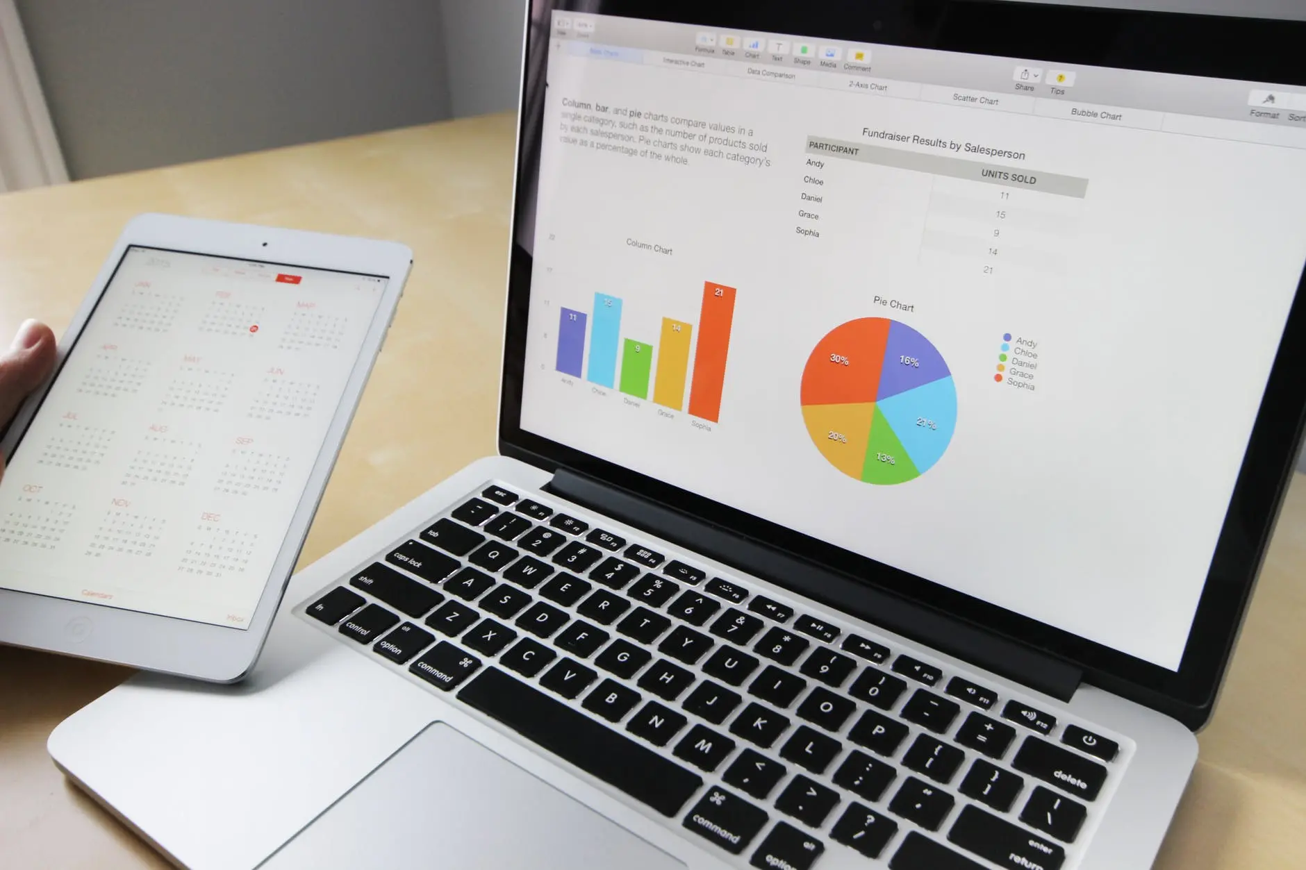
DV is, at its most basic, any visual presentation of data. An Excel spreadsheet doesn’t count, but charts that Excel can generate do. Good DV is structured in such a way that patterns in data become easier to see and understand.
Interactive DV empowers FP&A by putting practitioners in the driver’s seat, giving them accessible tools for data discovery, which is converted into information, and further transformed into knowledge (insights and foresights). This then assists business partners to make better, smarter decisions faster.
The bulk of data collected today is never fully analyzed. Data discovery tools help FP&A professionals find the trends and patterns that can help drive success and improvements in their organizations.
Good DV designed for data discovery has requirements that go beyond static graphs. There are three main characteristics of great visualizations for data discovery.
Interactive
Interactivity allows FP&A to ask questions (one of the most important functions of a good FP&A practice). A single fixed view of data is informative, but not explorable. The best interactive DV tools let the user ask questions through interaction with the DV itself.
Having the control interface directly in the DV lets FP&A practitioners explore the data intuitively. Visual cues like hovers, highlights, and other reactive elements keep the user focused on and engaged in the data while they explore connections and patterns.
Multidimensional
Multidimensional DV helps FP&A see relationships between different variables. Nearly all visualizations represent at least two dimensions of data. But many data sets have more than two dimensions, and smart design decisions are needed to keep multidimensional data views coherent and readable.
Visually Efficient
Efficient DV uses graph types that match their data sets. Some data sets have obvious visual graph styles. More complex data sets often need custom graph designs, which can display complex relationships and take many forms. However, they will always need to connect back to what is most important about the data.
A good DV typically conveys information in a dramatically smaller and more accessible footprint than the same data presented in tabular form. Because different graph types imply different kinds of relationships, it is important to use the ones that work with your data, and not against it.
Decisions made by visualization design shape what FP&A will see in the data. Well-designed DV is structured to help make important patterns in the data highly visible. Ultimately, DV exists to help FP&A professionals answer questions, and contribute in a meaningful and quantitative way towards the organization’s goals. The importance of data and the ability to distill core insights and foresights gleaned from data to make smart decisions is only going to grow.

Leave your comments
Post comment as a guest