Comments
- No comments found
When I get the quarterly announcements for what my retirement account is now worth, and a drop in the stock market has caused the total in the account to decline, I find myself looking at some of the long-run patterns in stock market prices.
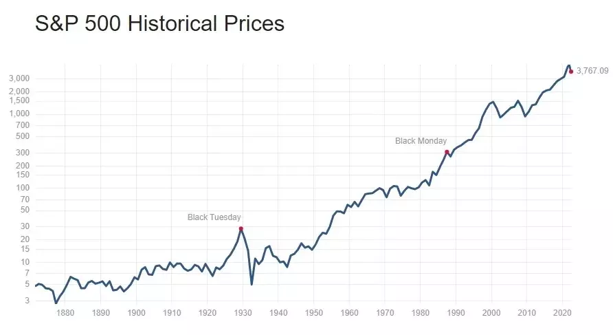
To set the stage, here’s the historical pattern of the S&P stock index since back in the 19th century. In interpreting the figure, notice that the vertical axis is a logarithmic axis showing proportional changes; for example, the tripling from 10 to 30 is the same size as the tripling from 100 to 300 and the same as the tripling from 1000 to 3000. (Without using a log scale, all the smaller values–like the stock market crash of 1929, would just be a little squiggle of what would look like a nearly flat line on the far left of the figure.) You can see some of the well-known changes in the stock market over time: the run-up of the 1920s, the crash of 1929, the run-up of the 1960s, the comparatively flat market of the 1970s, a big jump in the dot-com market of the 1990s, the run-up since 2009, and the recent decline.
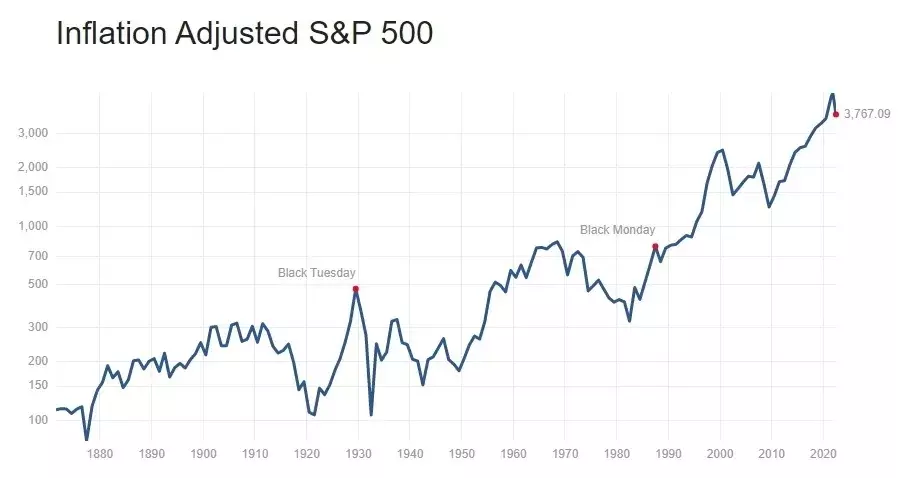
For a slightly different view, here is the same set of data, this time adjusted for inflation. Again, the vertical axis shows proportional change. Again, the main well-known changes are pretty visible, but they don’t all look the same. For example, after adjusting for inflation, the Black Tuesday stock market decline in the 1920s looks even more striking, and during the high-inflation 1970s, the real value of the S&P 500 index is falling.
Of course, stock market values should be affected by expectations of corporate earnings. Thus, the standard price-earnings measure of the stock market looks at stock prices divided by corporate earnings over the previous 12 months. Notice that the logarithmic scales have now gone away. Corporate earnings will rise over the long run both because of inflation and along with overall growth in the economy. Thus, one might expect to see the P/E ratio be roughly the same over time, of course with some fluctuations as economic events and market trends interact. Indeed, when you try to find the 1929 stock market crash in this data, it’s barely apparent: after all, if both stock prices and corporate earnings collapse at about the same time, then the ratio of the two may not move in an especially dramatic way.
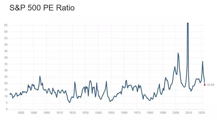
You can also see that from the late 19th century up to about 1990, the P/E ratio didn’t seem to have a long-run trend. It moved up and down, but was typically in the range of about 15-20. Starting in the 1990s, however, the P/E ratio moved way out of its historical range, first during the dot-com boom of the 1990s, then in the run-up to the 2008-9 Great Recession. After its recent decline, the P/E ratio is now actually back in its historical range.
However, the P/E ratio has at least one substantial drawback: if corporate earnings rise or fall sharply in a given year, perhaps for idiosyncratic reasons, then the denominator of the P/E ratio will be jumping around. It might be useful to look at the average of corporate earnings for a time longer than 12 months, to smooth out this kind of short-run variation. Thus, what is called the “cyclically-adjusted price earnings ratio, also known as the CAPE ratio or the Shiller ratio, divides the value of the S&P 500 index by the average inflation-adjusted earnings of firms in the index over the prior 10 years. Here’s the CAPE ratio:
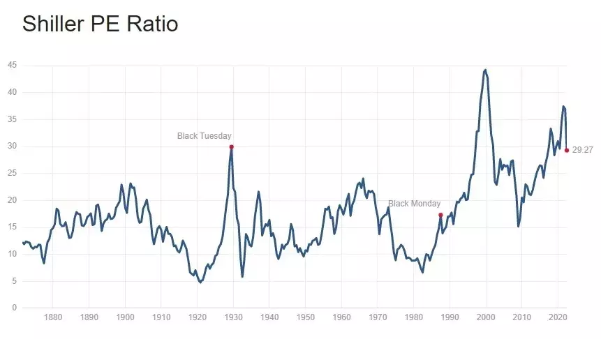
Notice that with this longer-term adjustment, Black Tuesday in 1929 becomes apparent again: essentially, the rise in stock prices in the 1920s and the fall in 1929 is now being compared not just to contemporary earnings, but to earnings over the previous 10 years. Something similar happened in the Great Recession of 2008-9: that is, the sharp decline in earnings drove the unadjusted P/E ratio in the previous figure sky-high, but when earnings are averaged over the previous decade, the CAPE ratio doesn’t show a similar peak. Again, there doesn’t seem to be much of a long-run trend in stock market prices up to about 1990, but then stock prices break out to historically high levels.
Recent movements in stock market prices look a little different in the context of CAPE ratio. The jump in 2021 looks smaller than with the regular P/E ratio, and the recent decline also looks smaller. The difference arises because corporate earnings have grown rapidly in the last five years or so. This growth in earnings tended to hold down the plain vanilla P/E ratio up to 2021–because the S&P 500 was rising with these earnings–but with longer-term average earnings taken into account the rise in stock market prices pre-2021 becomes more apparent. By the CAPE metric, stock prices after their recent decline are still at high although not historically unprecedented levels.
Will the stock market stay at this higher CAPE level? I’m definitely not in the prediction business, and even more definitively not in the short-term prediction business. But Eric Zitzewitz, without making a prediction himself, summarizes some of the key issues in one of the always-useful briefs from the Econofact website:
There are reasons that a higher-than-normal CAPE might be appropriate in 2022. First, interest rates are lower than inflation, so the real interest rate (the nominal rate minus the inflation rate) is negative. This should increase the amount an investor should be willing to pay for $1 of current earnings since earnings (and the dividends they fund) should grow with inflation while the alternative of holding a bond rather than a stock is less attractive because of still low nominal interest rates. Second, high price-earnings ratios in the United States partly reflect a sectoral sorting between the United States and Europe in which the United States has more high-growth technology companies and Europe more slower-growing consumer goods corporations. Third, CAPE, by design, underreacts to recent earnings growth. Earnings have grown very rapidly in the last decade: After not growing at all per unit of the S&P 500 between 2006 and 2016, earnings have almost doubled in 5 years, adjusted for inflation. When attempting to predict future performance using past performance, it is sensible to put more weight on more recent performance. CAPE does not do this; in benchmarking value against equal-weighted average prior earnings, it implicitly takes the 10-year average as its prediction of future earnings. Valuations in 2021 look less like an outlier if we benchmark them with prior-year earnings, as in the simple P/E ratio.
Here is one final benchmark, known as the Buffett ratio, because Warren Buffett said back in 2001 in a Fortune Magazine interview that “it is probably the best single measure of where valuations stand at any given moment.” It’s the ratio of all publicly traded stocks (as measured by the Wilshire 5000 index) to the US gross domestic product.
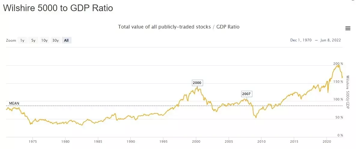
From 1970 to the present, the average value of the Buffett ratio is a little under 90%: that is, the ratio of the value of all publicly traded stocks to GDP was a little under 90%. When Buffett made his comment in 2001, you could have made money expecting the ratio to decline: indeed, you could have also made money on this advice up to the period before the Great Recession. But the run-up in stock prices since 2009 took stock prices to about 200% of GDP before the recent decline–and the value still sits at about 170% of GDP. As Zitzewitz notes, your confidence in this stock market value will depend on the extent to which you think recent increases in corporate earnings are likely to be lasting, as well as on how you evaluate the “sectoral sorting” of high growth companies into the US economy.
Of course, whenever you are contemplating that perhaps the stock market is behaving irrationally and that perhaps you can make money betting that it will return to its “true” value, it is worth remembering the uncertainties involved in such judgements, and in particular, to remember the old investment aphorism that “the market can remain irrational longer than you can remain solvent.”
Timothy Taylor is an American economist. He is managing editor of the Journal of Economic Perspectives, a quarterly academic journal produced at Macalester College and published by the American Economic Association. Taylor received his Bachelor of Arts degree from Haverford College and a master's degree in economics from Stanford University. At Stanford, he was winner of the award for excellent teaching in a large class (more than 30 students) given by the Associated Students of Stanford University. At Minnesota, he was named a Distinguished Lecturer by the Department of Economics and voted Teacher of the Year by the master's degree students at the Hubert H. Humphrey Institute of Public Affairs. Taylor has been a guest speaker for groups of teachers of high school economics, visiting diplomats from eastern Europe, talk-radio shows, and community groups. From 1989 to 1997, Professor Taylor wrote an economics opinion column for the San Jose Mercury-News. He has published multiple lectures on economics through The Teaching Company. With Rudolph Penner and Isabel Sawhill, he is co-author of Updating America's Social Contract (2000), whose first chapter provided an early radical centrist perspective, "An Agenda for the Radical Middle". Taylor is also the author of The Instant Economist: Everything You Need to Know About How the Economy Works, published by the Penguin Group in 2012. The fourth edition of Taylor's Principles of Economics textbook was published by Textbook Media in 2017.
BBN Times connects decision makers to you. Experts in their fields, worth listening to, are the ones who write our articles. We believe these are the real commentators of the future. We quickly and accurately deliver serious information around the world. BBN Times provides its readers human expertise to find trusted answers by providing a platform and a voice to anyone willing to know more about the latest trends. Stay tuned, the revolution has begun.
Leave your comments
Post comment as a guest