Comments (3)
Wayne Thompson
I still remember when graphs were difficult to create
Ian Stewart
Thoughtful read
Jason Cheng
I like graphs that use clear colours
When I started working as the Managing Editor of the Journal of Economic Perspectives back in 1986, making figures for academic articles was still relatively expensive.
The changeover to software-generated figures was getting underway, but with lots of hiccups--for example, we had to purchase a more expensive printer that could produce figures as well as text. At my home base at the time, Princeton University still employed a skilled draftsman to create beautiful figures, using tools like plotting points and tracing along the edge of a French curve, which have now gone the the way of the slide rule.
Generating figures has now become cheap: indeed, I see more and more first drafts at my journal which include at least a dozen figures and often more. I sometimes suspect that the figures were generated for slides that can be shown during a live presentation, and then the paper was written around the series of figures. Economists and other social scientists, like it or not, need to know something about what makes a good graph. Susan Vanderplas, Dianne Cook, and Heike Hofmann give some background in "Testing Statistical Charts: What Makes a Good Graph?" (Annual Review of Statistics and Its Application, 2020, subscription required).
With a good statistical graph or figure, readers should be able to read information or see patterns with reasonable accuracy (although people have a tendency to round up or down). As the authors write (citations omitted):
A useful starting point is to apply gestalt principles of visual perception, such as proximity, similarity, common region, common fate, continuity, and closure, to data plots. These principles are useful because good graphics take advantage of the human visual system’s ability to process large amounts of visual information with relatively little effort.
The authors discuss research on the extent to which certain graphs meet this goal: for example, one can use "think-aloud" methods where subjects talk about what they are seeing and thinking about as they look at various figures, or eye-tracking studies to find what people are actually looking at. They also focus on statistical charts, not on the production of more artistic "infographics." Along with general tips, I've been interested in recent years about the use of color.
The authors argue that when using a range of colors, best practice is to use a neutral color in between a range of two other colors. They also point out that the human eye does not discern gradations in all colors equally well: "It is also important to consider the human perceptual system, which does not perceive hues uniformly: We can distinguish more shades of green than any other hue, and fewer shades of yellow, so green univariate color schemes will provide finer discriminability than other colors because the human perceptual system evolved to work in the natural world, where shades of green are plentiful." In terms of human physiological perceptions, " a significant portion of the color space is dedicated to greens and blues, while much smaller regions are dedicated to violet, red, orange, and yellow colors. This unevenness in mapping color is one reason that the multi-hued rainbow color scheme is suboptimal—the distance between points in a given color space may not be the same as the distance between points in perceptual space. As a result of the uneven mapping between color space and perceptual space, multi-hued color schemes are not recommended." In addition, some people are color-blind: the most common kind is an inability to distinguish between red and green, but there are also people who have difficulties distinguishing between blues and greens, and between yellows and reds.
Given these realities, what range of color is recommended? The bottom purple-orange gradient both circles through a neutral color and is also distinguishable by people with any sort of color-blindness. Of course, this doesn't mean it should always be used: people may have mental associations with colors (say, blue associated with cold) that make it useful to use other colors. But it's worth remembering.

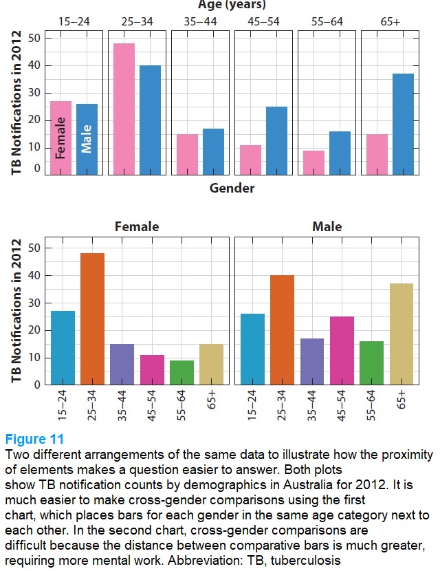
For an example of how a better graph can help with perception, consider this example. The graph is looking at notifications for tuberculosis in Australia in 2012, divided by age and gender. The top panel shows gender side-by-side for each age group, with two colors used to distinguish gender. The bottom panel shows age groups side-by-side for each gender, with five colors used to distinguish ages. The authors argue that "common region" arguments make it easier for most viewers get information from the top figure.
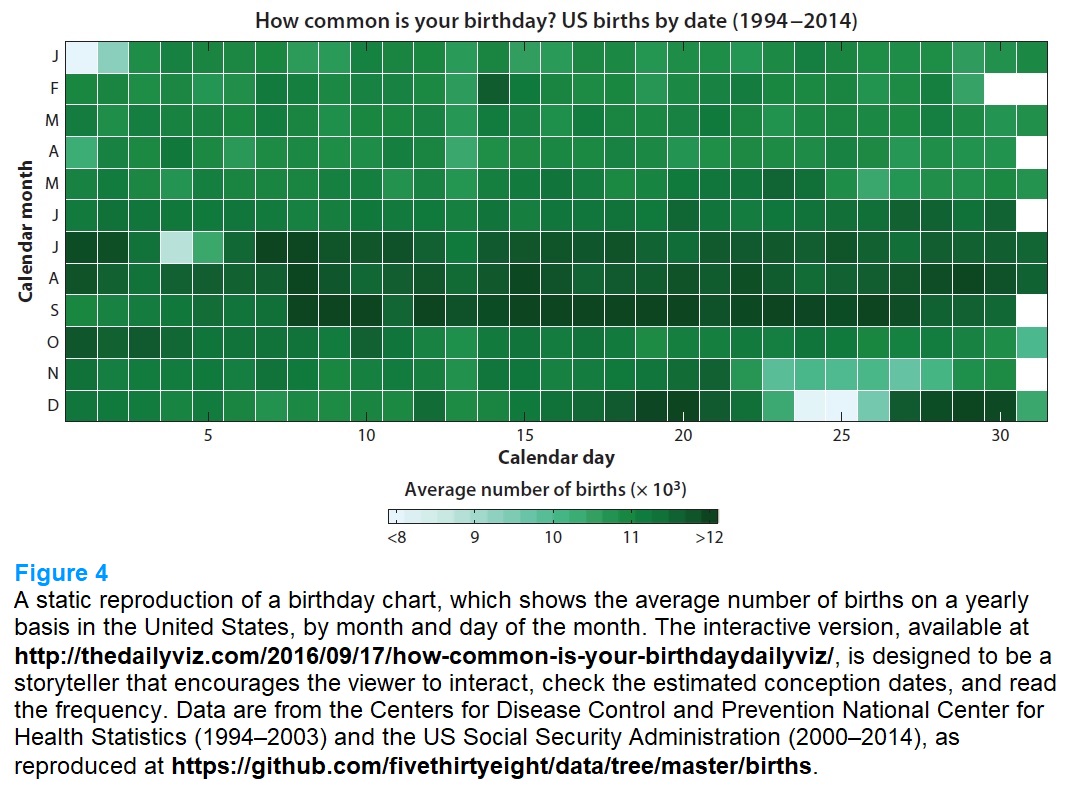
Finally, here's an example of a graph that is "interactive," even though it is static. The graph shows the average number of births on each day of the year. Notice that although there's a lot of shading, it's in green so the distinctions are easier to perceive. Key takeaways stand out easily: like more babies born in summer than in winter, and fewer births around holidays like July 4, Thanksgiving, Christmas, and New Year's. Also, the natural tendency for a reader is to check out their own birthday--which is what makes the figure interactive. It's easy to imagine other kinds of figures--by age, gender, location, income, education, and so on--that might cause readers to interact in a similar way by checking out the data for their own group.
For those who want to dig deeper, the article has lots more examples and citations. For more on graphic presentations of data, a useful starting point from the journal where I work as Managing Editor is the paper by Jonathan A. Schwabish in the Winter 2014 issue. "An Economist's Guide to Visualizing Data." Journal of Economic Perspectives, 28 (1): 209-34. From his abstract: "Once upon a time, a picture was worth a thousand words. But with online news, blogs, and social media, a good picture can now be worth so much more. Economists who want to disseminate their research, both inside and outside the seminar room, should invest some time in thinking about how to construct compelling and effective graphics."
For some history of graphs, I've blogged on "William Playfair: Inventor of the Bar Graph, Line Graph, and Pie Chart" (August 9, 2017), and on "Florence Nightingale: Innovator in Statistics and Data Presentation" (May 12, 2020).

I still remember when graphs were difficult to create
Thoughtful read
I like graphs that use clear colours
Timothy Taylor is an American economist. He is managing editor of the Journal of Economic Perspectives, a quarterly academic journal produced at Macalester College and published by the American Economic Association. Taylor received his Bachelor of Arts degree from Haverford College and a master's degree in economics from Stanford University. At Stanford, he was winner of the award for excellent teaching in a large class (more than 30 students) given by the Associated Students of Stanford University. At Minnesota, he was named a Distinguished Lecturer by the Department of Economics and voted Teacher of the Year by the master's degree students at the Hubert H. Humphrey Institute of Public Affairs. Taylor has been a guest speaker for groups of teachers of high school economics, visiting diplomats from eastern Europe, talk-radio shows, and community groups. From 1989 to 1997, Professor Taylor wrote an economics opinion column for the San Jose Mercury-News. He has published multiple lectures on economics through The Teaching Company. With Rudolph Penner and Isabel Sawhill, he is co-author of Updating America's Social Contract (2000), whose first chapter provided an early radical centrist perspective, "An Agenda for the Radical Middle". Taylor is also the author of The Instant Economist: Everything You Need to Know About How the Economy Works, published by the Penguin Group in 2012. The fourth edition of Taylor's Principles of Economics textbook was published by Textbook Media in 2017.
BBN Times connects decision makers to you. Experts in their fields, worth listening to, are the ones who write our articles. We believe these are the real commentators of the future. We quickly and accurately deliver serious information around the world. BBN Times provides its readers human expertise to find trusted answers by providing a platform and a voice to anyone willing to know more about the latest trends. Stay tuned, the revolution has begun.
Leave your comments
Post comment as a guest