Comments
- No comments found

Joseph Priestley (1733 – 1804) was an English polymath, philosopher, educator and scientist who is most famous for his discovery of Oxygen. In 1765 he published a “Chart of Biography” to accompany a series of history lectures.
It showed the lives of famous people as lines on a chart. He said it would allow students to “trace out distinctly the dependence of events to distribute them into such periods and divisions as shall lay the whole claim of past transactions in a just and orderly manner.”
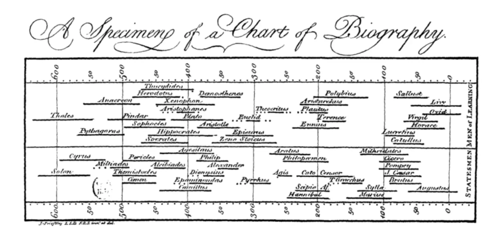
It was a remarkable innovation. It gave readers a completely new view of data. Most writers would have included a table of dates, but Priestley’s chart enabled visualisation of the information. You could easily see a chronology of lifespans; how long people had lived and to what extent their lives overlapped. The full charts spanned an enormous time period from 1200 BC to 1800 AD, and included two thousand names of eminent statesmen, warriors, scientists, philosophers, poets and artists. Priestley’s “principle of selection” was fame, not merit. He made other charts including one covering world history. They proved enormously popular; his “New Chart of History” was published in fifteen editions by 1816.
Florence Nightingale (1820 – 1910) served as a hospital administrator and trainer of nurses during the Crimean War. She is now renowned as the founder of modern nursing. She became a legend in Victorian England as “The Lady with the Lamp” making rounds of wounded soldiers at night in hospital. She was a keen mathematician and a pioneer in the use of statistics. She was the first woman admitted to the Royal Society of Statistics. She was a reformer and wanted to use data to advance her case for better hygiene and medical care for soldiers. She is famous for usage of the polar area diagram, also called the Nightingale rose diagram, which she included in her 1858 paper presented to the Secretary of State for War.
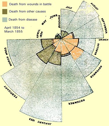
This remarkable graph is like a pie chart, with twelve segments representing twelve months of the year from April 1854 to March 1855. The size of each slice shows how many deaths occurred in that month. Each slice has three sections, one for deaths from wounds in battle, one for “other causes”, and one for disease. It can clearly be seen that deaths in battle make up a small part of total deaths, even in months with major battles. This new way of visualising complex data made the case to the British Parliament that diseases like cholera, typhus, and dysentery were killing far more soldiers than the enemy were. Her argument won the day and major reform of the army hospital system was started.
The London Underground railway system (known as the Tube) was the first of its kind in the world. It was a major and successful urban innovation, but some passengers found it complicated to understand and difficult to navigate. In 1933 Harry Beck, an electrical draughtsman who worked on the Underground came up with a revolutionary new design. He chose not to show accurate distances and geography. Instead he created a neat and simplified layout. He based his ideas on the circuit diagrams he used in his work. He redrew the straggling Tube network as a simple tidy diagram with coloured, criss-crossing lines. It clearly showed the sequence of stations and where the junctions occurred.
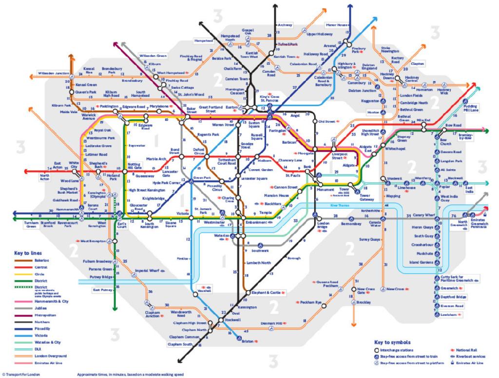
Beck’s map was considered too radical and was initially rejected by management, but a trial run showed that it was popular with and understood by the public. It became a symbol for the London Underground and was copied by transport chiefs around the world. Its design is still used today.
Priestley, Nightingale and Beck found new ways to convey information in visual form. They replaced conventional tables and charts with clever new visualisations which increased understanding.
Paul is a professional keynote conference speaker and expert facilitator on innovation and lateral thinking. He helps companies improve idea generation and creative leadership. His workshops transform innovation leadership skills and generate great ideas for business issues. His recent clients include Airbus, Microsoft, Unilever, Nike, Novartis and Swarovski. He has published 30 books on lateral thinking puzzles, innovation, leadership and problem solving (with over 2 million copies sold). He also acts as link presenter at conferences and facilitator at high level meetings such as a corporate advisory board. He has acted as host or MC at Awards Dinners. Previously, he was CEO of Monactive, VP International of MathSoft and UK MD of Ashton-Tate. He recently launched a series of podcast interviews entitled Insights from Successful People.
BBN Times connects decision makers to you. Experts in their fields, worth listening to, are the ones who write our articles. We believe these are the real commentators of the future. We quickly and accurately deliver serious information around the world. BBN Times provides its readers human expertise to find trusted answers by providing a platform and a voice to anyone willing to know more about the latest trends. Stay tuned, the revolution has begun.
Leave your comments
Post comment as a guest