Comments
- No comments found

PowerPoint has become an ubiquitous tool for delivering information in various settings, such as business meetings, conferences, and educational settings.
While the other slide presentations can enhance communication and improve the clarity of messages, there is growing evidence that they can also inhibit critical thinking and hinder deeper understanding.
Twenty years ago, Edward Tufte published The cognitive style of PowerPoint: pitching out corrupts within, an essay that still speaks to many of us who have sat through presentations where bullet points are read aloud to us, one by one by one, and where the speaker feels a need to race through the last two-dozen slides in the final five minutes of allotted time.
Tufte studied thousands of slides from actual presentations, and offered detailed and precise analysis of concrete examples. But for a sense of his overall argument, I’ll quote only some of his broader themes:
The fans of PowerPoint are presenters, rarely audience members. Slideware helps speakers to outline their talks, to retrieve and show diverse visual materials, and to communicate slides in talks, printed reports, and the internet. And also to replace serious analysis with chartjunk, over-produced layouts, cheerleader logotypes and branding. and corny clipart. That is, PowerPointPhluff.
PP convenience for the speaker can be costly to both content and audience. These costs result from the cognitive style characteristic of the standard default PP presentation: foreshortening of evidence and thought, low spatial resolution, a deeply hierarchical single-path structure as the model for organizing every type of content, breaking up narrative and data into slides and minimal fragments, rapid temporal sequencing of thin information rather than focused spatial analysis, conspicuous decoration and Phluff, a preoccupation with format not content, an attitude of commercialism that turns everything into a sales pitch. …
Many true statements are too long to fit on a PP slide, but this does not mean we should abbreviate the truth to make the words fit. It means we should find a better way to make presentations. With so little information per slide, many many slides are needed. Audiences consequently endure a relentless sequentiality, one damn slide after another. When information is stacked in time, it is difficult to understand context and evaluate relationships. Visual reasoning usually works more effectively when the relevant information is shown adjacent in space within our eyespan. This is especially the case for statistical data, where the fundamental analytical act is to make comparisons …
In day-to-day practice, PowerPoint templates may improve 10% or 2o% of all presentations by organizing inept, extremely disorganized speakers, at a cost of detectable intellectual damage to 80%. For statistical data, the damage levels approach dementia. Since about 1010 to 1011 PP slides (many using the templates) are made each year, that is a lot of harm to communication with colleagues. Or at least a big waste of time. The damage is mitigated since meetings relying on the PP cognitive style may not matter all that much. By playing around with Phluff rather than providing information, PowerPoint allows speakers to pretend that they are giving a real talk, and audiences to pretend that they are listening.
Tufte is of course a genius at thinking about effective graphical presentation of data. Many of us are not going to live up to his standard. But many of us can do better, too. As he points out, a good image that presents a set of data relationships can convey a great deal, and breaking those messages into bullet-points can obscure so much.
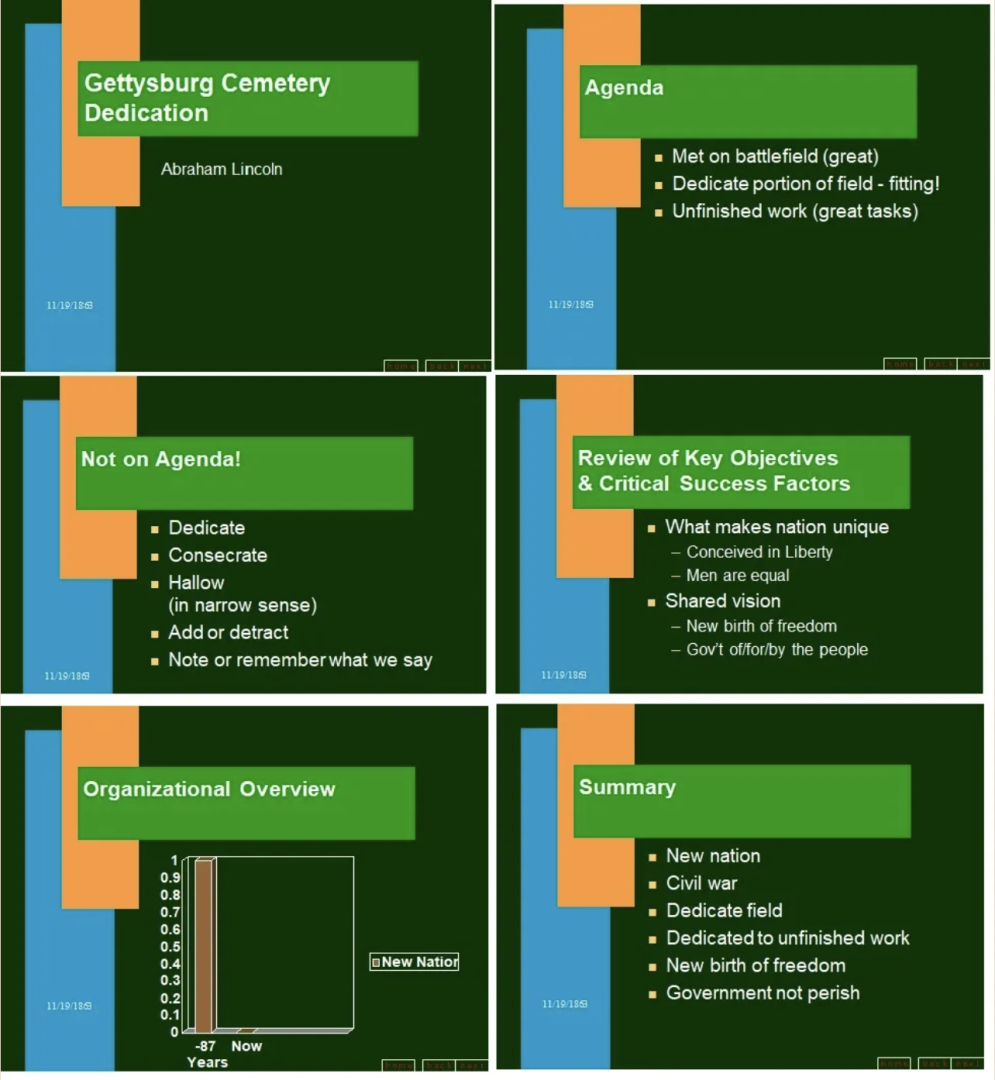
Tufte quotes from perhaps the classic Powerpoint satire of all time, Peter Norvig’s “Gettysburg Powerpoint Presentation.” Notice that it manages to include six slides for a two-minute presentation. Before the more famous part of the text, Lincoln would begin:
Good morning. Just a second while I get this connection to work. Do I press this button here? Function-F7? No, that’s not right. Hmmm. Maybe I’ll have to reboot. Hold on a minute. Um, my name is Abe Lincoln and I’m your president. While we’re waiting, I want to thank Judge David Wills, chairman of the committee supervising the dedication of the Gettysburg cemetery. It’s great to be here, Dave, and you and the committee are doing a great job. Gee, sometimes this new technology does have glitches, but we couldn’t live without it, could we? Oh – is it ready? OK, here we go:
The speech that follows would be accompanied by six slides, which are perhaps not in the most useful order, but hey, the slides show professionalism and really help out the audience, right?
In a similar vein, Gokul Rajaram recently posted an anecdote about his experience in creating a set of slides for Eric Schmidt at Google:
In 2006, I helped Eric Schmidt [CEO of Google at the time] create a deck outlining Google’s strategy, for a presentation Eric was delivering to the company. It taught me a profound lesson on how to present.
When I showed up to my first meeting with Eric, he asked me to visit with every product team at Google, chat with them to figure out what they were working on, and then summarize it on one slide (for each team).
Easy enough, I thought. I would use 3-5 bullet points per slide.
“But”, Eric said, “I want no words on any slide”.
My well-laid plans disintegrated in an instant. How was I supposed to convey the key messages from each team, without WORDS?
Eric must have seen the panic on my face, and kindly gave me a hint. “Put the text in speaker notes”.
“But what goes on the slides, Eric?” I continued panicking.
That classic, gentle “Eric smile” fluttered on his face. “Why, images, of course!”
“You mean, you want each slide to just be comprised of images?”
“You got it. And use the title wisely. 7-8 words max. Let’s meet in a week to review progress.”
Rajaram suggests several lessons from his experience. For example, one of them is “The larger the audience, the fewer the words on the slide.” But my point here is not to reify Schmidt’s approach to slide-decks, or Tufte’s for that matter. (Tufte is a believer in detailed paper handouts to accompany slides, which might have been workable in 2003 when he wrote his essay, but is so countercultural in 2023 as to be from a different era.) I just think we would all be better off with slide presentations that have fewer bullet points, fewer pages jam-packed with words, and fewer detailed numerical tables that can’t be read by anyone more than 30 feet away. Presentations impose costs of time and attention on others. In successful presentations, your attention is attracted, rather than taxed, and the entire time feels well-spent.
Timothy Taylor is an American economist. He is managing editor of the Journal of Economic Perspectives, a quarterly academic journal produced at Macalester College and published by the American Economic Association. Taylor received his Bachelor of Arts degree from Haverford College and a master's degree in economics from Stanford University. At Stanford, he was winner of the award for excellent teaching in a large class (more than 30 students) given by the Associated Students of Stanford University. At Minnesota, he was named a Distinguished Lecturer by the Department of Economics and voted Teacher of the Year by the master's degree students at the Hubert H. Humphrey Institute of Public Affairs. Taylor has been a guest speaker for groups of teachers of high school economics, visiting diplomats from eastern Europe, talk-radio shows, and community groups. From 1989 to 1997, Professor Taylor wrote an economics opinion column for the San Jose Mercury-News. He has published multiple lectures on economics through The Teaching Company. With Rudolph Penner and Isabel Sawhill, he is co-author of Updating America's Social Contract (2000), whose first chapter provided an early radical centrist perspective, "An Agenda for the Radical Middle". Taylor is also the author of The Instant Economist: Everything You Need to Know About How the Economy Works, published by the Penguin Group in 2012. The fourth edition of Taylor's Principles of Economics textbook was published by Textbook Media in 2017.
BBN Times connects decision makers to you. Experts in their fields, worth listening to, are the ones who write our articles. We believe these are the real commentators of the future. We quickly and accurately deliver serious information around the world. BBN Times provides its readers human expertise to find trusted answers by providing a platform and a voice to anyone willing to know more about the latest trends. Stay tuned, the revolution has begun.
Leave your comments
Post comment as a guest