Comments
- No comments found

Project management is a dynamic sphere where intricate details require deft handling.
Among the many tools used by project managers, the gauge chart stands out for its simplicity and usefulness. Understanding what a gauge chart is and how it works can revolutionize your approach to project management. Keep reading as we delve deeper into this important tool.
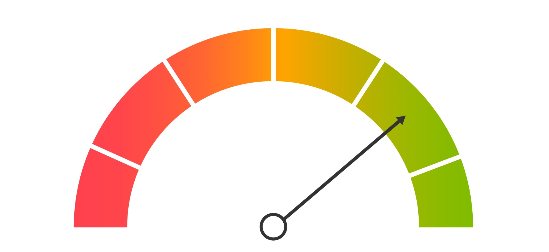
So, what is a gauge chart? Gauge charts, also known as dial or speedometer charts, are unique tools that allow the visualization and measurement of data in a distinctive and relatable way. They borrow their design from real-world gauges, leading to uncomplicated interpretation.
To understand a gauge chart, imagine your car's fuel gauge. Similarly, a gauge chart represents metrics through sections, where each section signifies a range of values. In a project management setup where fractions and percentages often rule the roost, gauge charts bring in easy-to-comprehend visual metrics. Their simplicity allows for immediate recognition and understanding of project conditions.
Looking at a gauge chart offers a snapshot of your project’s current status. It puts an end to laborious explanations and tedious tracking, thus saving time and increasing efficiency.
Gauge charts work effectively in monitoring crucial aspects of projects. They reflect the status of a project, be it behind schedule, on track, or ahead of schedule, in a simplified manner.
Gauge charts are useful in monitoring the financial aspects of a project. By using gauge charts to monitor budgets or expenses, you can give stakeholders an easy-to-understand visual of the financial health of the project.
Using gauge charts to represent timelines helps project members understand where the project currently stands against a planned schedule. When multiple projects are running simultaneously, gauge charts help comparably represent their progress.
Similarly, if your project has specific key performance indicators (KPIs) or success metrics to hit, gauge charts show, in an easy-to-understand way, how close or far you are from achieving those metrics.

Gauge charts are specifically created to represent data in an uncomplicated manner, making them an excellent visual tool for observance of project progress.
When it comes to projects, gauge charts help illustrate milestone completions, budget utilization, resource allocation, and more. One look at the chart can convey whether one is lagging behind, moving as per plan, or progressing ahead.
One major advantage of using gauge charts is the flexibility they offer. Depending on the project's requirements, the sections of a gauge chart can be customized to depict variances, risks, and progress succinctly.
Whether project deliverables are being met on time or not or whether the response times are within acceptable ranges, gauge charts deliver the answer visually and in an almost instant way.
Gauge charts are a potential game changer if utilized effectively in project management practices. They not only simplify the monitoring of key metrics but also contribute to efficient data-driven decision-making.
By incorporating gauge charts in project management, teams can set clear expectations and visible goals. As these charts aid in quick understanding, the team can be quickly aligned toward common executive strategies and goals. Additionally, gauge charts can help evaluate team performance, track efficiency, and identify areas that may need attention or improvement. They are instrumental in building clarity and have the stylistic edge to make data intriguing and eye-catching.
By understanding the leverage points of a project represented by a gauge chart, project managers can devise and carry out effective strategies with ease. A gauge chart acts as a bridge between qualitative plans and quantitative results.
Overall, gauge charts offer an efficient way to visualize key project metrics and progress. Their ease of understanding and flexibility make them a powerful tool for project managers, potentially revolutionizing project management methodologies.
BBN Times connects decision makers to you. Experts in their fields, worth listening to, are the ones who write our articles. We believe these are the real commentators of the future. We quickly and accurately deliver serious information around the world. BBN Times provides its readers human expertise to find trusted answers by providing a platform and a voice to anyone willing to know more about the latest trends. Stay tuned, the revolution has begun.
Leave your comments
Post comment as a guest