If you’re new to the field of Data Science, I wanted to offer some tips on how to transition from presentations you gave in academia to creating effective presentations for industry.
Unfortunately, if your background is of the math, stats, or computer science variety, no one probably prepared you for creating an awesome data science presentations in industry. And the truth is, it takes practice. In academia, we share tables of t-stats and p-values and talk heavily about mathematical formulas. That is basically the opposite of what you’d want to do when presenting to a non-technical audience.
If your audience is full of a bunch of STEM PhD’s then have at it, but in many instances we need to adjust the way we think about presenting our technical material.
I could go on and on forever about this topic, but here we’ll cover:
- Talking about model output without talking about the model
- Painting the picture using actual customers or inputs
- Putting in the Time to Tell the Story
Talking about Model Output without Talking about the Model
Certain models really lend themselves well to this. Logistic regression, decision trees, they’re just screaming to be brought to life.

You don’t want to be copy/pasting model output into your data science presentations. You also don’t want to be formatting the output into a nice table and pasting it into your presentation. You want to tell the story and log odds certainly are not going to tell the story for your stakeholders.
A good first step for a logistic regression model would just be to exponentiate the log odds so that you’re at least dealing in terms of odds. Since this output is multiplicative, you can say:
“For each unit increase of [variable] we expect to see a lift of x% on average with everything else held constant.”
So instead of talking about technical aspects of the model, we’re just talking about how the different drivers effect the output. We could, however, take this one step further.
Using Actual Customers to Paint the Picture
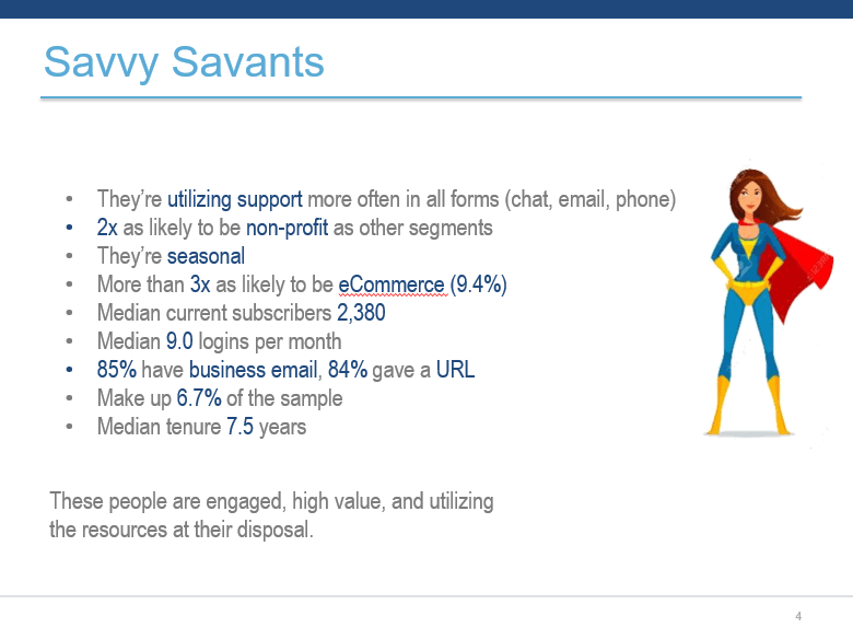
I love using real-life use cases to demonstrate how the model is working. Above we see something similar to what I presented when talking about my seasonality model. Of course I changed his name for this post, but in the presentation I would talk about this person’s business, why it’s seasonal, show the obvious seasonal pattern, and let them know that the model classified this person as seasonal. I’m not talking about fourier transforms, I’m describing how real people are being categorized and how we might want to think about marketing to them. Digging in deep like this also helps me to better understand the big picture of what is going on. We all know that when we dig deeper we see some crazy behavioral patterns.
Pulling specific customers/use cases works for other types of models as well. You built a retention model? Choose a couple people with a high probability of churning, and a couple with a low probability of churning and talk about those people.
“Mary here has been a customer for a long time, but she has been less engaged recently and hasn’t done x, y, or z (model drivers), so the probability of her cancelling her subscription is high, even though customers with longer tenure are usually less likely to leave.”
Putting in the Time to Tell the Story
As stated before, it takes some extra work to put these things together. Another great example is in cluster analysis. You could create a slide for each attribute, but then people would need to comb through multiple slides to figure out WHO cluster 1 really is vs. cluster 2, etc. You want to aggregate all of this information for your consumer. And I’m not above coming up with cheesy names for my segments, it just comes with the territory.
It’s worth noting here that if I didn’t aggregate all this information by cluster, I also wouldn’t be able to speak at a high level about who was actually getting into these different clusters. That would be a large miss on my behalf, because at the end of the day, your stakeholders want to understand the big picture of these clusters.
Every analysis I present I spend time thinking about what the appropriate flow should be for the story the data can tell. I might need additional information like market penetration by geography, (or anything, the possibilities are endless). The number of small businesses by geography may not have been something I had in my model, but with a little google search I can find it. Put in the little extra work to do the calculation for market penetration, and then create a map and use this information to further support my story. Or maybe I learn that market penetration doesn’t support my story and I need to do more analysis to get to the real heart of what is going on. We’re detectives. And we’re not just dealing with the data that is actually in the model. We’re trying to explore anything that might give interesting insight and help to tell the story. Also, if you’re doing the extra work and find your story is invalidated, you just saved yourself some heartache. It’s way worse when you present first, and then later realize your conclusions were off: womp womp.
Closing Comments
Before you start building a model, you were making sure that the output would be actionable, right? At the end of your presentation you certainly want to speak to next steps on how your model can be used and add value whether that’s coming up with ideas on how you can communicate with customers in a new way that you think they’ll respond to, reduce retention, increase acquisition, etc. But spell it out. Spend the time to come up with specific examples of how someone could use this output.
I’d also like to mention that learning best practices for creating great visualizations will help you immensely. There are two articles by Kate Strachnyi that cover pieces of this topic. You can find those articles here and here.
If you create a slide and have trouble finding what the “so what?” is of the slide, it probably belongs in the appendix. When you’re creating the first couple decks of your career it might crush you to not include a slide that you spent a lot of time on, but if it doesn’t add something interesting, unfortunately that slide belongs in the appendix.
I hope you found at least one tip in this article that you’ll be able to apply to your next data science presentation. If I can help just one person create a kick-ass presentation, it’ll be worth it.
A version of this article first appeared here.


Leave your comments
Post comment as a guest