Comments (5)
Alan Donnan
Very interesting, thanks for sharing.
Ross Avery
Good stuff !!
Helen Davies
Excellent article
Carl W
Shiny is complicated !
Michael Prentice
Good tutorial, thank you for the explanation.

Shiny is used by many data scientists and data analysts to create interactive visualizations and web applications.
While Shiny is an RStudio product and quite user-friendly, the development of a Shiny app differs significantly from the data visualization and exploration that you might do via the tidyverse in an RMarkdown file. There can therefore be a bit of a Shiny learning curve even for experienced R users, and this tutorial aims to introduce Shiny’s usage and capabilities through a brief conceptual overview as well the step-by-step creation of an example Shiny app.
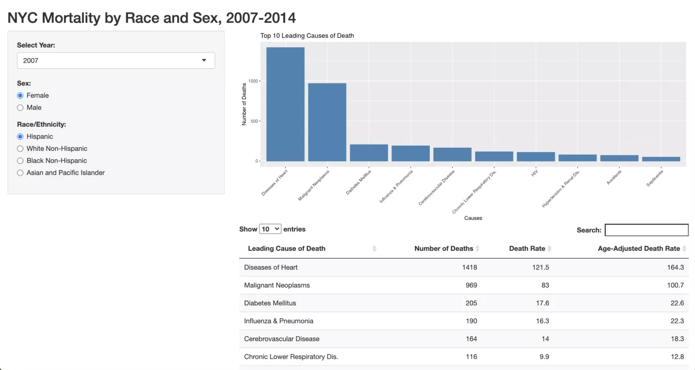
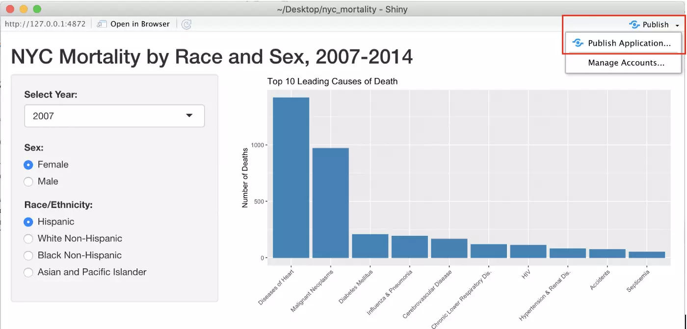
In this tutorial we’ll create the following Shiny app, which can be found in its full interactive form here. An associated GitHub repo can be found here. The dashboard allows users to explore data representing the top 10 leading causes of death among New Yorkers by year, sex, and race/ethnicity. We will have a bar chart that displays the number of deaths associated with each of these top leading causes of death, as well as a table which describes the leading causes of death, the number of associated deaths, the associated death rate, as well as the associated age-adjusted death rate.
What is Shiny?
Shiny is an R package designed to facilitate the creation of interactive web apps and dashboards. All of the coding can be done in R, so no web development skills are required to use Shiny effectively. However, Shiny does use a CSS, HTML, and JavaScript framework so familiarity with these languages can facilitate more advanced app development. You can easily host and deploy Shiny apps, and RStudio conveniently offers cloud and on-premises deployment options through shinyapps.io and Shiny Server, respectively.
I highly recommend spending some time exploring the Shiny Gallery. This is an excellent resource where you can see what other people have built with Shiny, as well as all of the underlying code. There are also Shiny Demos in the Gallery, which are designed by the Shiny developers to illustrate various features through simple examples.
User Interface (UI)
Shiny apps consist of a user interface (UI) and a server that responds to the UI and generates outputs.
The UI is essentially responsible for your app’s appearance and inputs. Appearance can be set in the UI by changing things like the app’s layout and colors, or by creating additional tabs.
Users create input via widgets, which are coded in the UI portion of the Shiny app. Widgets can take many forms, such as buttons, checkboxes, sliders, and text input. RStudio’s Shiny Widgets Gallery allows you to look through the available widget options, as well as the associated code that produces them.
Server
The server is where you build your outputs, such graphs, maps, values and tables. The server will contain the code to generate these outputs, as well as instructions for R regarding how the output should change based upon a given input in the UI.
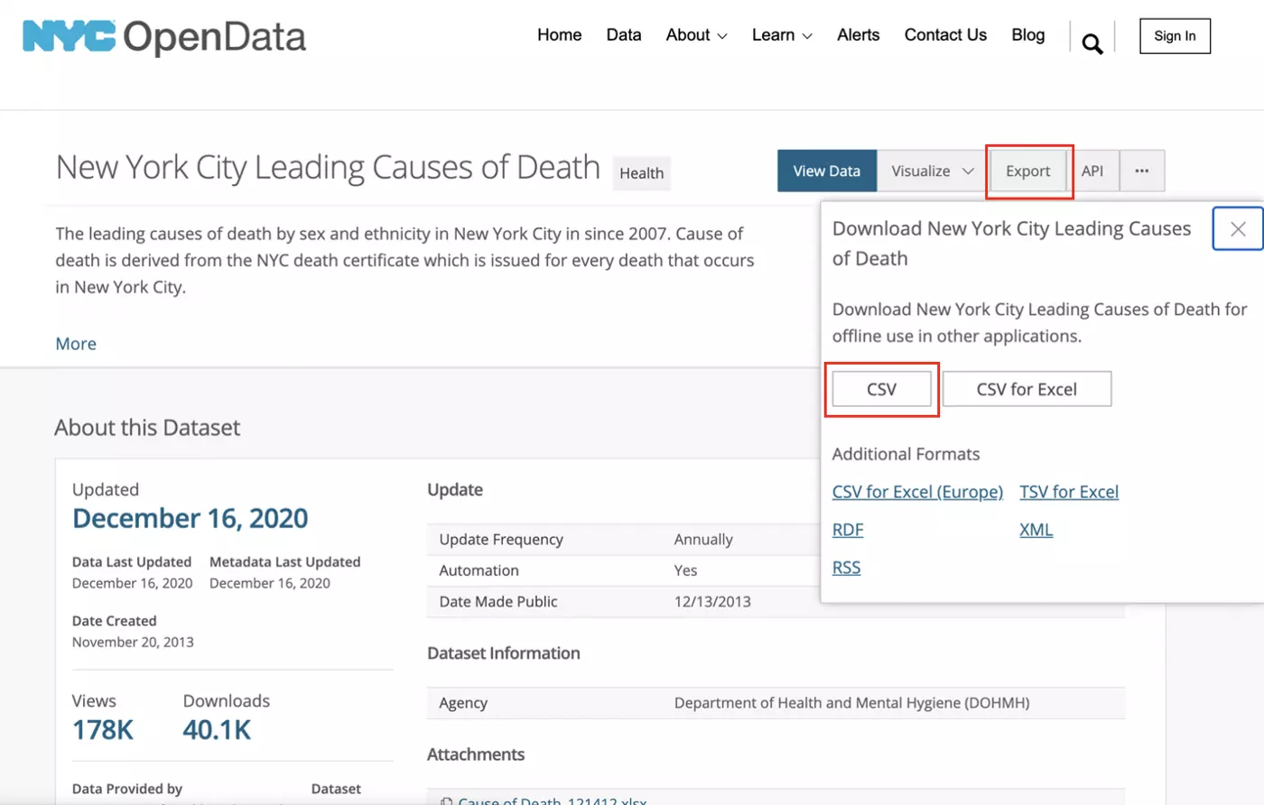
The dataset that we will be using in this tutorial is publicly available through NYC OpenData. The data represents the top 10 leading causes of death among New York City residents by sex and race between 2007 and 2014. Given my training in public health, I thought it would be interesting to explore how race and sex are related to causes of death as well as how these relationships may have changed over time.
In order to download these data, head to the NYC OpenData site for this datasource. The data will be available as a CSV file under “Export” as highlighted below. The download should start immediately when you click the CSV button.
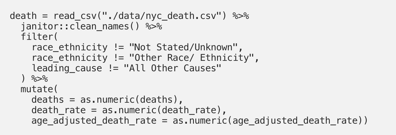
These data are fairly tidy, but we have a little bit of cleaning to do. I’ve changed the file name to “nyc_death.csv” and placed it in a folder titled “data” in a new R project.
First, let’s just load the “tidyverse” package in a new RMarkdown file:

This next code chunk performs a few basic cleaning processes. First, we use the read_csv() function to load in the mortality data. Then, we use the clean_names() function from the “janitor” package to put all variable names into snake case. Next, we perform some filtering. For the purposes of this app, we only need individuals with an identified race/ethnicity so we can filter out entries where the race_ethnicity value was “Not Stated/Unknown” or “Other Race/ Ethnicity.” The dataset also includes the top 10 leading causes of death for each race and sex combination, as well as all other causes lumped together. We only need these leading causes of death, so filter out rows where the leading_cause value is “All Other Causes.” Finally, we apply as.numeric() to three variables that we’ll be working with so that they are in the proper format for our analysis:
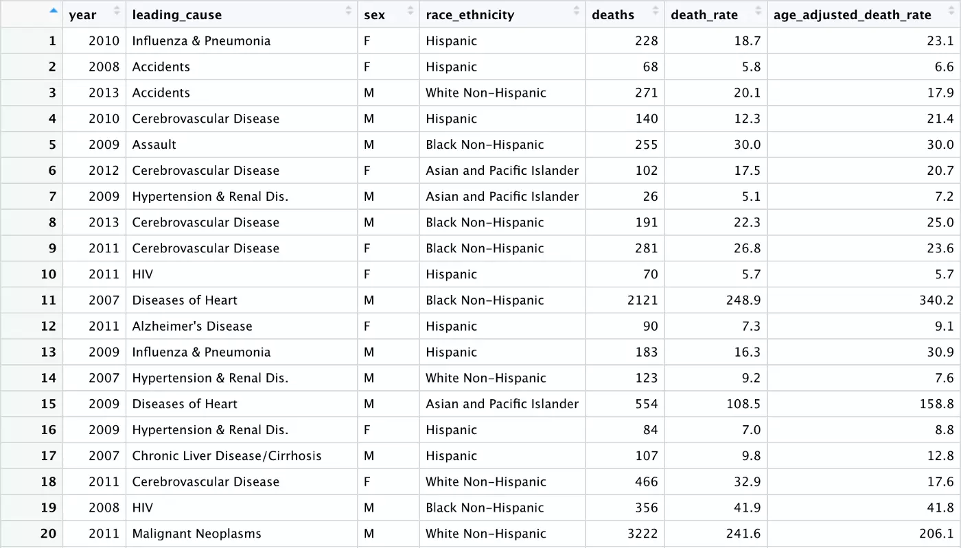
After conducting this basic cleaning, our data looks like this:
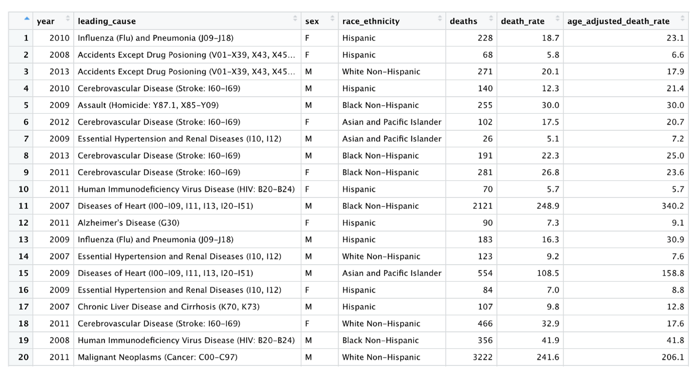
Overall, this looks pretty good. The values for our leading_cause variable, however, are very long and include cause of death codes. Our intended audience is a general audience, so these cause of death codes may not be that informative. This variable will also be used in the bar chart portion of our Shiny app, with the x-axis labels coming directly from this leading_cause variable. These very long descriptions would result in x-axis labels for our bar chart that aren’t very readable. It therefore makes sense to edit these values down to short, descriptive labels without cause of death codes.
The first step in making this change is identifying what values we need to change. We therefore need to know all unique values of the leading_cause variable that exist in this data set. The unique() function can give us this information:

We can see that there are 19 unique values for leading_cause that we need to consider shortening:

In order to edit these values, we need to dive into the long mutate() step below. In the first line of the mutate() step, we use str_replace_all() to remove all parentheses in this leading_cause variable. As you can see above, all values currently have cause of death codes included in parentheses. The function that we’ll be using to replace text, str_replace(), doesn’t work properly when there are parentheses included in the text so it makes sense to just remove them all right away.
Next, we simply use str_replace() to replace the text for each of these cause of death values. (Note: I copied these values directly from the unique() output to make it easier for myself — but don’t forget to delete the parentheses if you do the same!) The str_replace() function takes the following three arguments: the variable name where the string replacement should occur, the text pattern you want to replace, and what you want to replace it with. As you’ll see below, each of these str_replace steps takes leading_cause as the variable of interest, and original cause of death label next, and finally a shortened version that will look better in our bar chart:
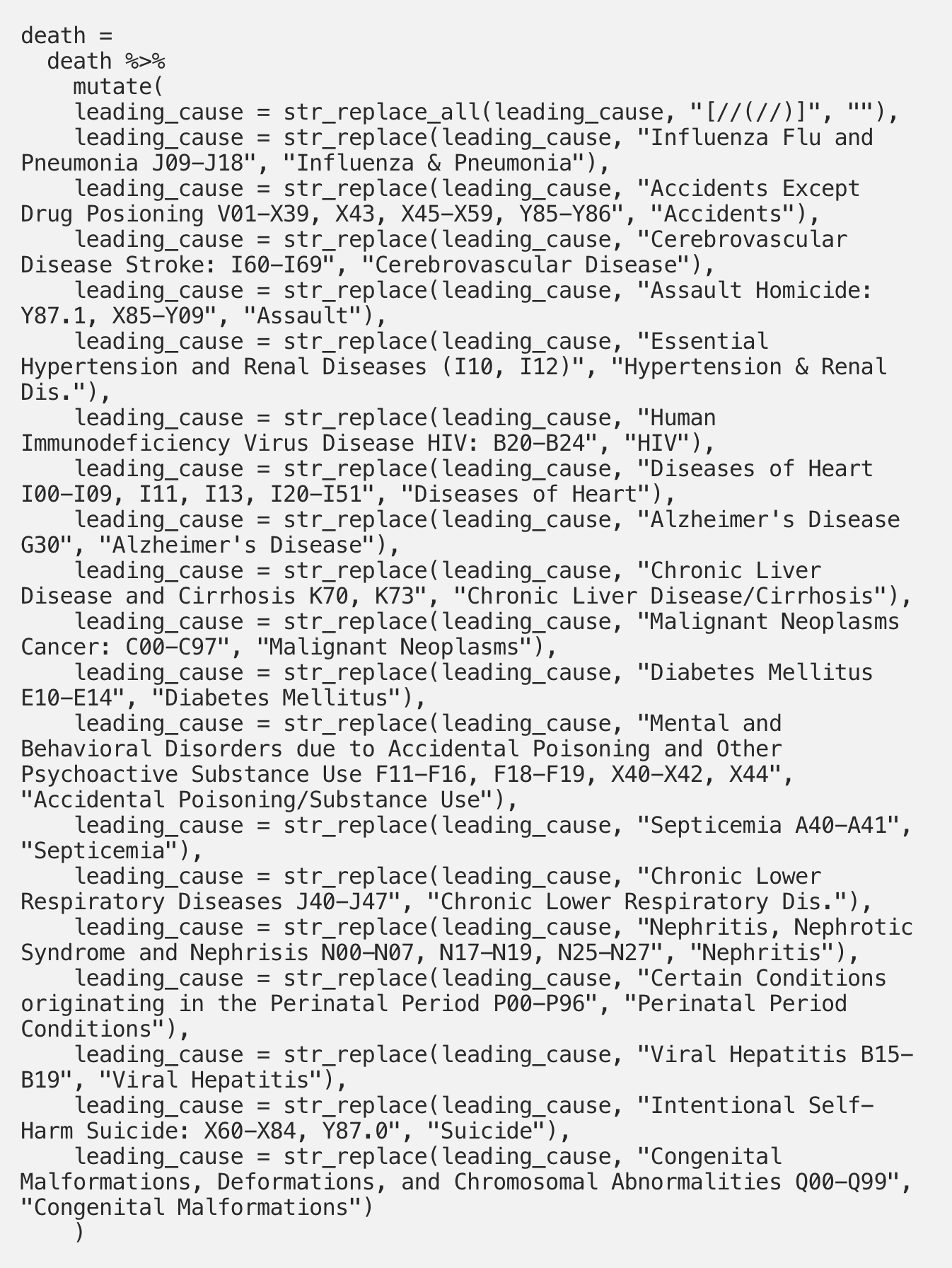
Now, our the values in our leading_cause variable look much neater and will work better in our bar chart:
Our data is good to go now, and the last step is exporting this final dataset for use in our Shiny app. This is done with the write_csv() function:

Now we’re ready to get going with Shiny!
The first thing we need to do is to create a new Shiny app in R. In RStudio, select File → New File → Shiny Web App:

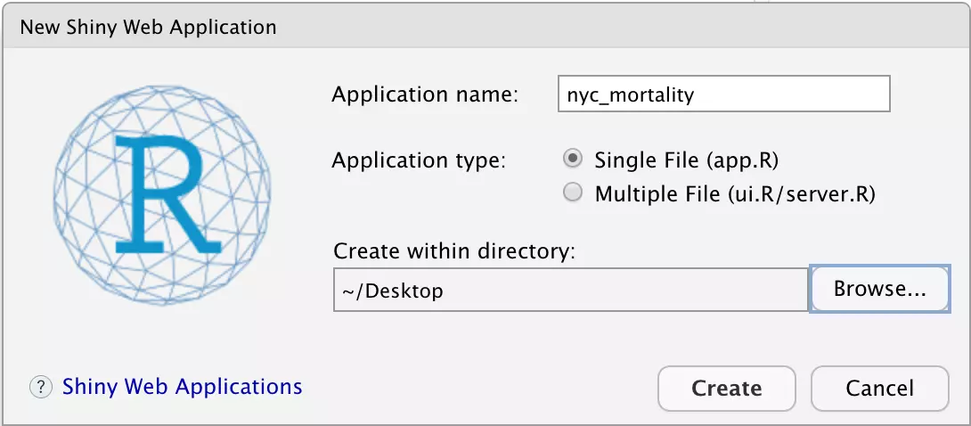
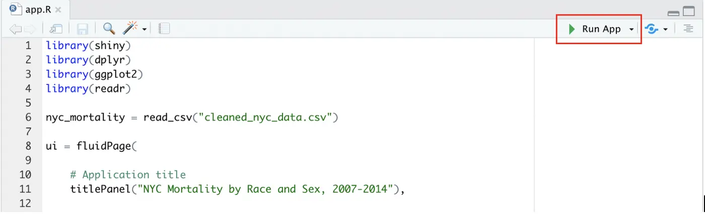
You will be prompted to select an application name, type, and location. The application type refers to whether or not the UI and server exist together in a single file, or if you have separate files for each. This selection is largely a matter of personal preference. It is typically easier to use the Multiple File type for complex apps with lots of code, and some people find the separation more straightforward even for simple apps. Personally, I like having all the code in one place for simple apps, so have chosen “Single File.” You can name your app anything and put it anywhere on your computer, but here I have named it “nyc_mortality” and placed it on my Desktop. Once you’ve made your selections, click “Create” in the bottom right:
Your app.R file should now appear. RStudio is great about providing helpful information about its creations to users, and Shiny is no different. This auto-populated code that appears when you create a new app is actually a full app in and of itself. You can try it out by clicking “Run App” in the upper right corner:
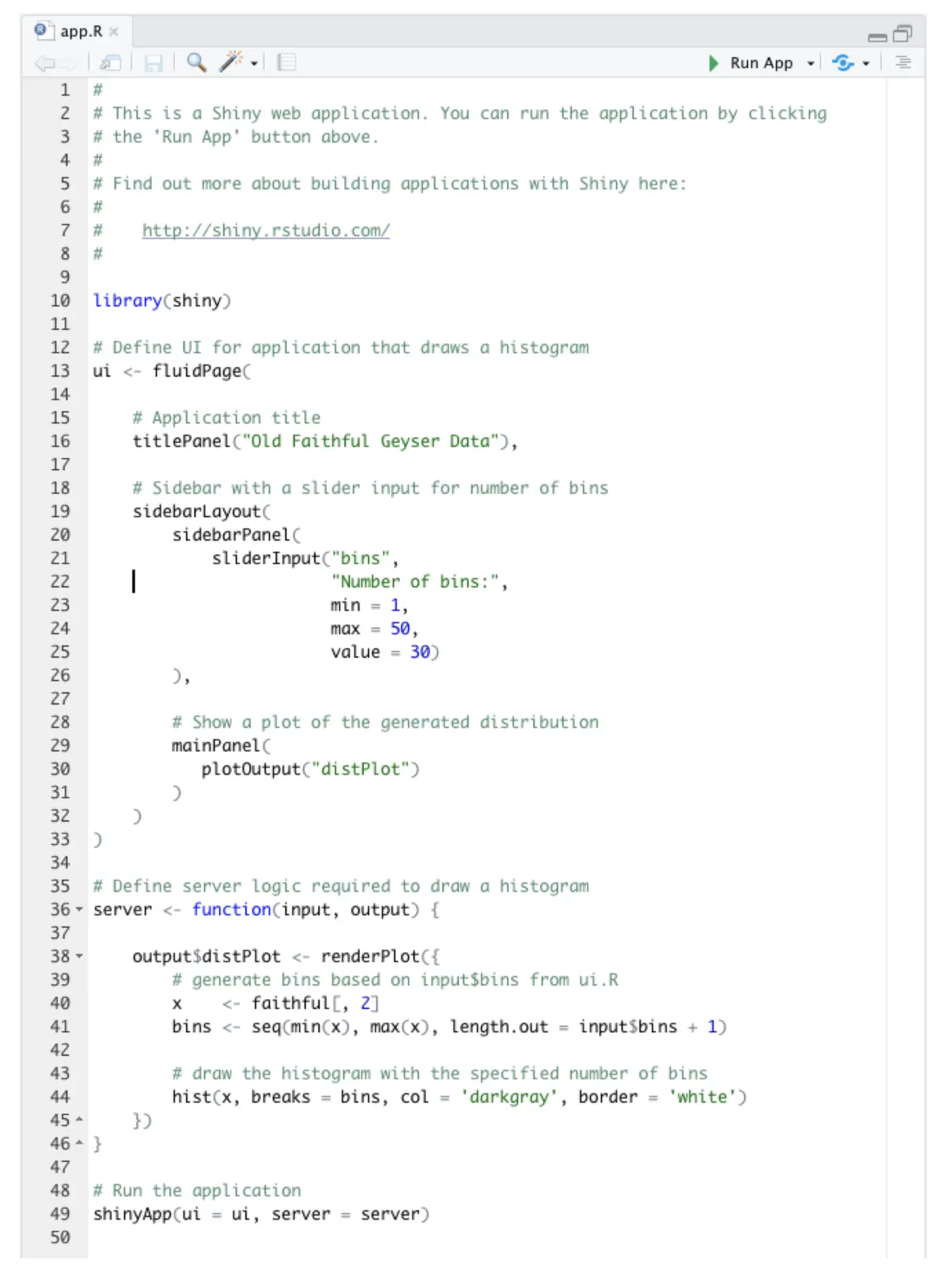
This Old Faithful Geyser Data app will appear, which contains a slider widget on the left and a histogram on the right. You can use the slider to change the number of bins present in the histogram. Play around with this for a moment to familiarize yourself with how Shiny apps work in their simplest form.
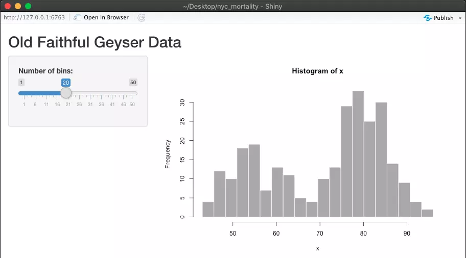
When you’re ready, clear out the Old Faithful Geyser Data code so that we can replace it with our own. You can delete everything besides the first line:

And the last line:

Note: instead of immediately deleting all of this sample code, I sometimes find it helpful to leave this code as a template and replace it gradually as I create my app. That’s actually what I did when I first created this app!
Before we move on, let’s just load the other packages that we’ll be using to create this app and let’s make our cleaned data available.
Load libraries:
Make sure that you have the cleaned dataset we created earlier wherever your app.R file is. Once you’ve done that, you can simply use read_csv() to make our data available:

Let’s move on to coding our own Shiny app.
As a refresher, this is the app that we’ll be creating:
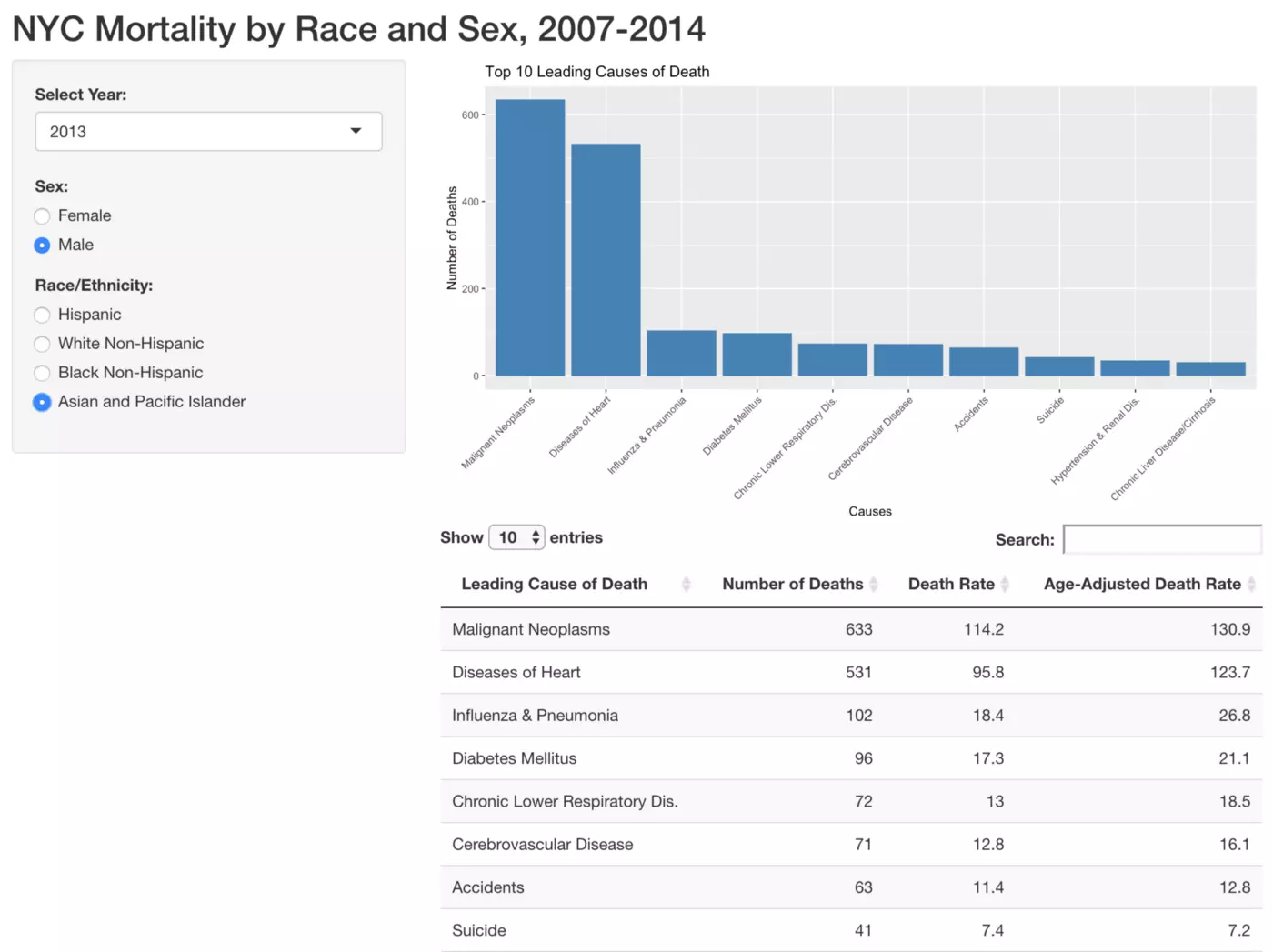
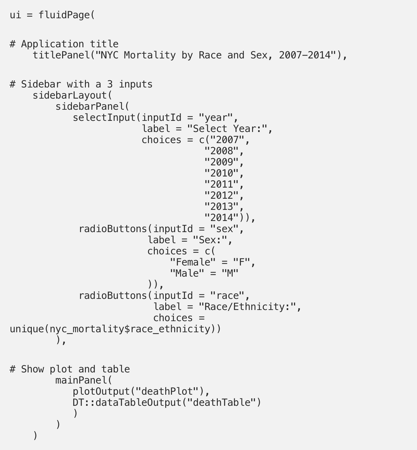
Remember that the UI essentially controls what the user sees and interacts with. We are therefore going to try to accomplish three things with our UI code: to create the “NYC Mortality by Race and Sex, 2007–2014” title, to create the Year, Sex, and Race/Ethnicity selectors on the right, and to set up the layout for the plot and table that we’ll create in the server step.
We do all three of these things in one long chunk of code that defines the UI. All of this code is contained within a fluidPage() command. Keep in mind that Shiny uses camel case, which can be a bit of a frustrating adjustment for those of us used to snake case (thisIsCamelCase and this_is_snake_case). First, we create our title using the titlePanel() function by simply writing it out within quotation marks. Next, we create our three widgets in the sidebar. There’s a lot of code in this part, so let’s take it step by step.
Our sidebar has only one panel, so all three widgets are contained within a single sidebarPanel() function within the sidebarLayout() function. Our first widget is a drop-down selector, which we create with the selectInput() function. The inputId argument determines how you will refer to this widget when writing your server code, and the label argument is where you set the text that will appear above the widget in the app itself. The choices argument is just as it sounds — here you specify the options that will be available to select from in your widget. There a few different ways to specify choices, and we’ll cover three of them below. For our selectInput() widget, our choices are simply a list of all of the years represented in our dataset.
Next comes our first radioButtons() widget. We assign an inputId and label again, but now we create our choices slightly differently. In the raw data, the two options for sex are “F” and “M.” That’s informative enough in some contexts, but it will be clearer and will look nicer to have “Female” and “Male” written out next to these radio button selectors. We can do simply this by indicating in the “choices” argument that “Female” = “F” and “Male” = “M.”
We then add our second radioButtons() widget. Yet again the inputId and label arguments are quite straightforward, but we take a third approach to the choices argument here. We want to make it possible to filter by every available race/ethnicity, but don’t want to have to dig through the data to figure out what these values are. Fortunately, we can bypass that step by using the unique() function again. This function makes the available options for the radio button widget all unique values of the race_ethnicity variable in the nyc_mortality dataset.
Last but not least, we set up the layout for the main panel. As you can see above, this panel will contain a bar chart and a table. We haven’t actually created these outputs yet - we’re just telling Shiny where they’ll go once we do create them. We do this with the mainPanel() function, and have one line of code for each of our outputs. The bar chart is called first using the plotOutput() function, and in quotation marks we give our future bar plot the name “deathPlot.” Our table is called next using the dataTableOutput() function from the DT package and is assigned the name “deathTable”.
Our UI should now be good to go, and we can move on to the server.
Recall that the server is where we create our outputs (in this case our bar plot and our table), as well as where we tell them how to react to the input that users can create through the widgets.
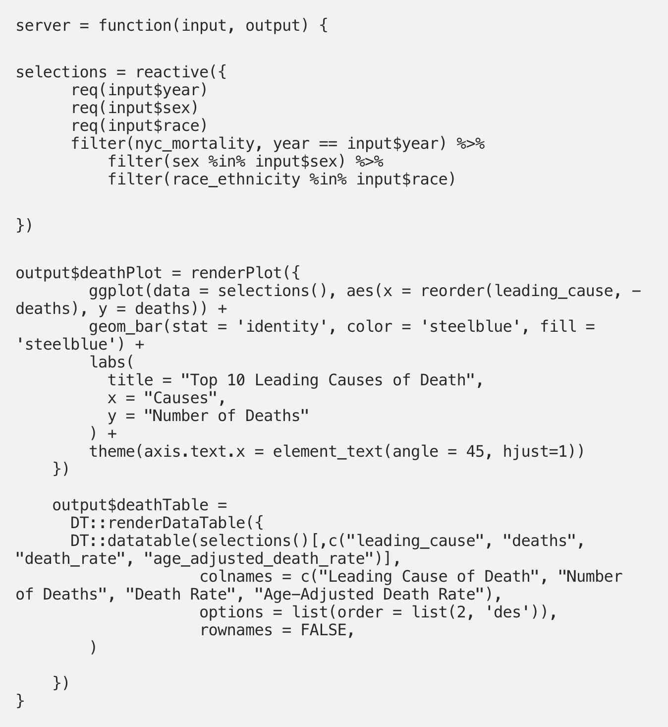
The server is a function that takes an input and an output argument, and all of our code to create our customized server comes within this function. First, we create an object that I’ve labeled as “selections” that filters our nyc_mortality data based upon user input in the widgets. This is done using the reactive() function, which makes sense because the plots “react” to the user input. Within the reactive() function, we first require the three inputs that we created in the UI. These names should align exactly with the inputId names that were created in the UI. Next, we tell the nyc_mortality dataset to filter the year variable based on the “year” input, the sex variable based on the “sex” input, and the race_ethnicity variable based on the “race” input.
We can now create our two outputs: the bar chart and the table. We start with the bar chart, which has been identified as “deathPlot”. Remember, the name you give this plot has to exactly match the name you gave it in the mainPanel() function in the UI. We tell Shiny to output a plot using the renderPlot() function, and then create this plot in a fairly standard way using ggplot(). This code will look quite familiar if you are familiar with ggplot(), although we make a few adjustments to make this plot reactive to user input. The first of these changes comes with the “data” argument. Instead of designating our data source as nyc_mortality (the cleaned dataset that we’ve been working with), our data is specified as that “selections()” object that we just created. We do not want to plot all of the data in the nyc_mortality dataset as once — rather, we only want to plot data for the year, age, and sex combination that has been selected by the user. By assigning “selections()” as our data source, we only pass the filtered version of the nyc_mortality dataset to our plot. We then move on to the aes() specifications, where you tell ggplot what you’d like on your x and y axes. In our case, we’d like these leading causes of death as our x axis and the number of associated deaths on our y axis. However, ggplot automatically arranges character variables on the x-axis alphabetically and this isn’t a particularly useful arrangement for our plot. Instead, it makes more sense to have the leading causes of death arranged by decreasing numbers of deaths. We accomplish this using the reorder() function, and specifying within it that the leading_cause variable should be ordered by decreasing (specified with the “-”) numbers of deaths.
Next we tell ggplot that the plot should be a bar chart using geom_bar(). The “stat = ‘identity’” bit of code indicates that there is no need for ggplot to try to aggregate our data — we will provide the y-values directly through our “death” variable. The last thing we do in the geom_bar() portion of code is to specify a blue color for the bars of our graph using the “color” and “fill” arguments. Finally, we use standard ggplot() code to give our chart a title and axis labels, and then tilt the x-axis labels at a 45-degree angle to make our chart more readable.
Finally, we use the “DT” package to create a table called deathTable. Inside the renderDataTable() function from the DT package, we use the datatable() function which also comes from the DT package. Yet again we use the selections() object instead of our full nyc_mortality dataset. In brackets, we specify the four columns that we’re interested in: leading_case, deaths, death_rate, and age_adjusted_death_rate. The colnames() function allows us to assign names that are more readable to each of these variables. These names will appear as the column headers in our final table. Under the “options” argument, we indicate that the data should be ordered based upon column 2 (deaths) in descending order. As in our bar chart, organizing causes of death by descending numbers of deaths will be much more informative than the default option of alphabetical organization.
Now our server is coded as well! In case you accidentally deleted it earlier, make sure that you have the following line of code following your server code:

The app is now completed, so go ahead and click “Run App” in the upper right corner.
Take some time playing around with the widgets in the left panel to make sure that the outputs react properly. If everything seems to be working, we’re ready to move on to hosting the app!
While there are many ways to host Shiny apps, shinyapps.io is ideal for first-time Shiny users because it is free and easy to use. We will therefore be using this tool to host our app.
If you do not have a shinyapps.io account linked to RStudio, you can follow sections 2.1 to 2.3.1 of this simple guide created by RStudio.
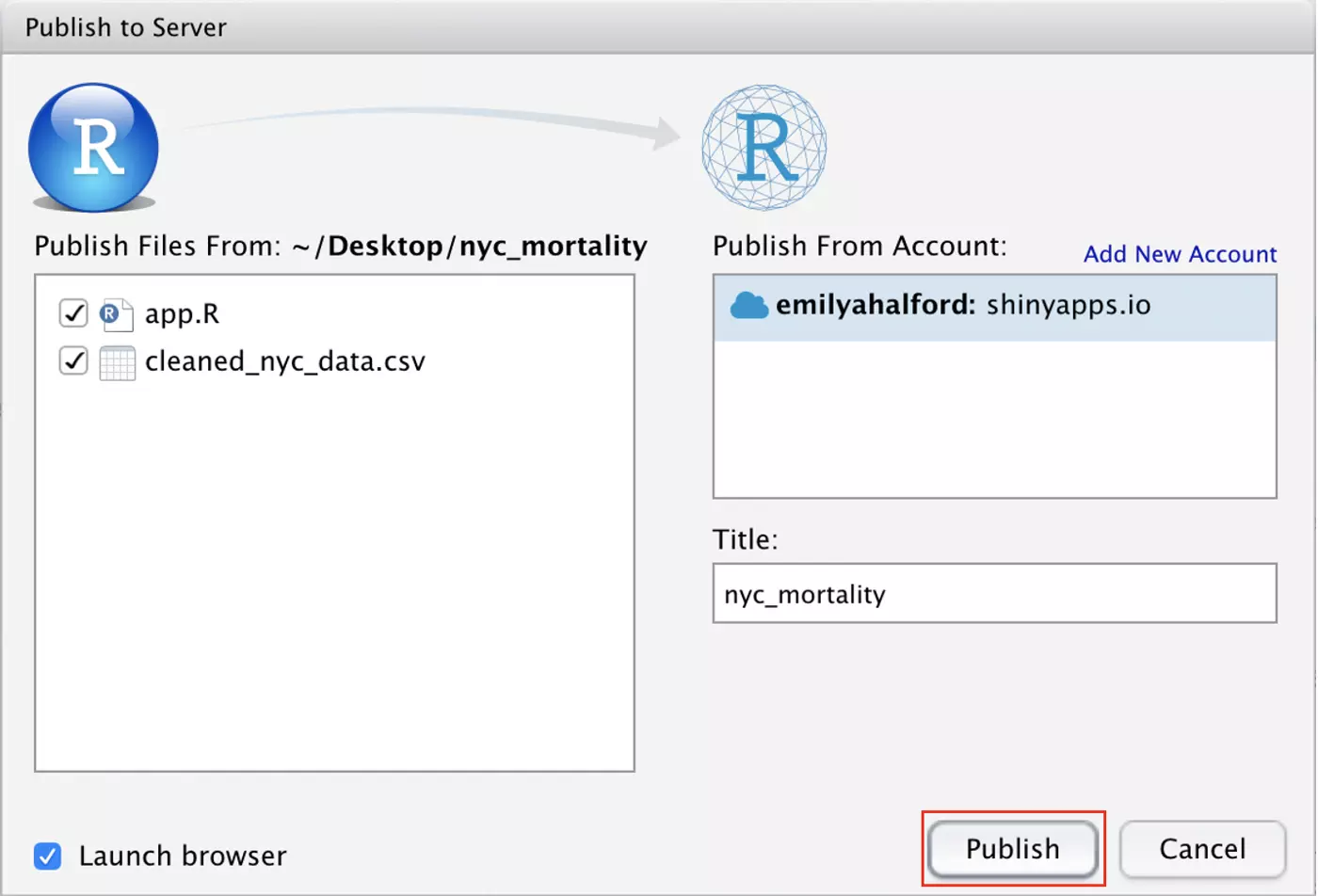
Once that connection has been made, select “Publish” in the top right corner of the Shiny app. Next, select “Publish Application…” from the drop-down menu that appears.
The following window will appear. Your shinyapps.io account should be connected, and the necessary files should already be checked. Leave “Launch browser” checked in the bottom left corner so that your finished app will pop up in your browser once deployment is complete. Make sure that you’re happy with the title of your app, then go ahead and click “Publish”!
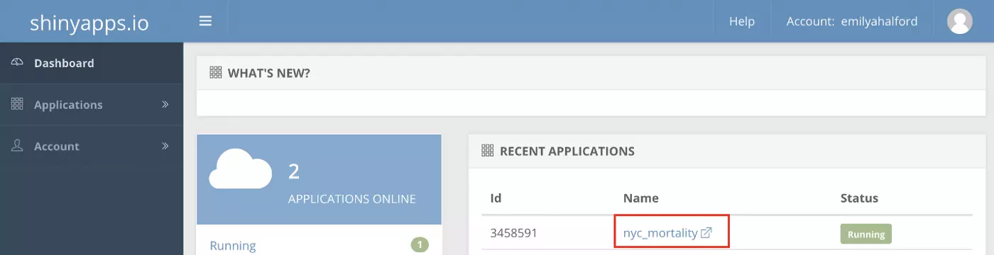
Deployment will begin immediately and can take several minutes. Once it is complete, your browser should open and display your newly-deployed app. If you log into your shinyapps.io account, you should also now see that your app is up and running!
Shiny is an incredibly useful tool that R users can use to build all sorts of dashboards and interactive products. It is capable of so much more than we’ve covered in this tutorial, but hopefully, you now feel like you understand Shiny’s basics. I suggest looking back at the Shiny Gallery again now that you’ve built your own Shiny app. Hopefully you now have a better understanding of how these apps were created, and maybe you’ll take away inspiration for your next Shiny project.
A final word of advice — a drawback of Shiny development is that it can be difficult to check your work along the way. In this example, we wrote all of our code before the app was able to run. As you progress to more complex apps, I suggest starting simple to make sure that pieces of your app work before adding more functions and complexity. When this is possible, it can save you lots of de-bugging frustration down the line.
As long as you are careful as you add code and make use of the wealth of resources available to you online (especially those created by RStudio!), you should have no problem exploring the numerous and exciting capabilities of Shiny.

Very interesting, thanks for sharing.
Good stuff !!
Excellent article
Shiny is complicated !
Good tutorial, thank you for the explanation.
Emily is a data analyst working in psychiatric epidemiology in New York City. She is a suicide-prevention professional who is enthusiastic about taking a data-driven approach to the mental health field. Emily holds a Master of Public Health from Columbia University.
BBN Times connects decision makers to you. Experts in their fields, worth listening to, are the ones who write our articles. We believe these are the real commentators of the future. We quickly and accurately deliver serious information around the world. BBN Times provides its readers human expertise to find trusted answers by providing a platform and a voice to anyone willing to know more about the latest trends. Stay tuned, the revolution has begun.
Leave your comments
Post comment as a guest