Leads are important for all kinds of businesses but not all websites are able to produce them in the same amount.
Reportedly, 61% of B2B marketers find it hard to generate converting leads. That’s more than half the lot, and quite possibly you have had your fair share in that bracket.
But not more, because we’re going to show you how to strengthen the path from where, most visitors convert into customers - Forms.
Keeping a form out there on your website is one thing but optimizing it for gaining leads is a totally different process, one that makes the most difference when it comes to collecting leads.
So, what makes people trust your content and want to buy from you? What makes the cut? Here are some valuable tips!
1. Make Forms Not Look Like Forms
Here’s the thing, people no more like filling forms that look drab and ask too much input from their side. But if the form looks like a series of guided steps with easy to process options along the way, users readily click through it.
There are many ways by which you can make forms interesting.
- Decrease the number of text input fields
If there are going to be text input fields in your form such as for name and email address, try to keep them as limited as possible. Use drop down options and smart UI elements that the use can simply click to submit response.
- Spread the form out to the page
If you notice how modern forms are built, you will find that all of them are spread mostly to the full page above the fold. Bigger forms are easier to read for the user and they allow you to add more information in them without making them look cluttered. Full page allows ample space for CTAs as well.
- Use Visual Clues to guide the user
The easier the form is to figure, the lesser effort the user would have to put in it and the more users would be inclined to fill it out. Hence, using visual clues such as icons, photos and navigation arrows for inputs can work wonders while catching leads.
2. Reduce Cognitive Load
Psychology says that internet users find non-cognitive work easier to carry out. It means that users don’t like forms that look like riddles or need them to solve puzzles to submit their details.
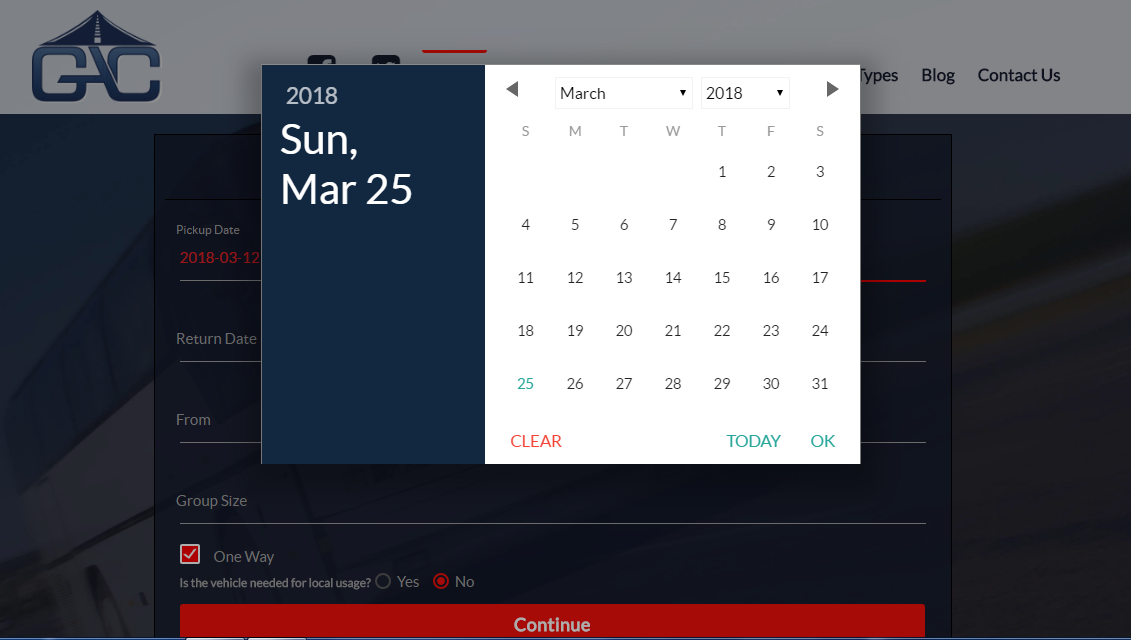
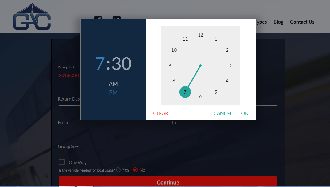
Simple forms that mean business is what you need to be looking at. Take the following form for example.
This is a lead generation website developed for an Travel Booking Business that displays a simple quote generation form at its front. The form makes use of UI elements such as calendars and clocks for inputting values that otherwise need keyboard input, making the process much more interactive.
3. Implement Conditional Logic
Conditional Logic in lead generation forms is a great way to boost UX as well as categorize users according to their responses.
Many modern form generators such as LeadFormly apply this in their forms. It works by hiding certain questions on the form based on some initial questions answered by the user.
It’s like:
- If the user says yes to questions A and B, then question C is shown.
- If the user says no to any of the A and B, then question C is not shown.
This makes the form lengthy or short depending upon the need of information required from the user. It also eradicates the need for filling irrelevant questions and saves on users total time spend.
4. Optimize the Call-To-Action
The second most important thing while collecting leads via forms is using strong CTAs. A CTA could be anything like a button, a catch-phrase or a banner that demands an action from the user.
The CTA can both invite the user to begin filling the form or promote them to submit it, depending where it has been placed.
Here are a few ways to optimize CTAs:
The buttons that inflict an action such as “Submit now” or “Continue” must be designed in a way that is eye-catchy and needs minimal effort to spot. Here is a quick example how this point takes effect.
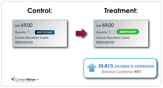
The button needs to be in a higher contrast than the rest of the elements and should clearly tell the user what to do.
The text on the button also needs to be very well thought. You can always type simple words like “Submit” or “Click here to Submit” but they aren’t as effective as something “You’re Done!”
Make the button text personally targeted and as humane as possible. Using simple pronouns like, “Sign Me Up!”, “Show Me How!”, “I am interested” can act as great segways for people to handover their details.
Conclusion
The above mentioned tactics should help you capture 20 - 46% more leads than you generally do. After all, more leads equals more customers and more sales. We at Dikonia create similar business solutions that are helping people grow.
View our portfolio to know more about our work.


Leave your comments
Post comment as a guest