Comments
- No comments found

Businesses use different strategies while designing their landing pages to lure prospects.
They all want to achieve the same goal of high conversion rates.
Landing pages are the gateways to your websites where you receive the prospects. A good landing page converts the visitors effortlessly. While entering their personal details, visitors should not feel the need to think twice. Although designing a good landing page needs many efforts. You need to plan your page right so that people don’t mind trusting you before giving their details.
To make the experience seamless, businesses use many strategies. To build trust in their company, they may provide something for free, related to their business. In return, they get personal details of their prospects. It might be anything including an ebook, a tutorial video, a demo class, and so on. Giving them something of value will encourage them to sign up for more.
Landing pages are stand-alone pages that are designed specially to fulfill a specific purpose. What makes them so different is their aim to convert visitors. Below is an image showing what should be asked for high conversions.
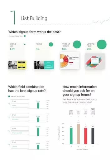
It is clear that when websites delve into the personal details of visitors, they lose conversions. So it’s better to keep the signup form simple and don’t ask too many questions. They should not feel like they are being interviewed or there could be a threat to their personal details (sharing personal details makes them vulnerable and no one wants to feel that).
Campaign Monitor says that the average conversion rate across all industries is 2.35 percent.
Conversion rates show how many people answered your call to action. The key to conversions is the design of your landing page. So here is a list of the five learnings from the best landing pages to improve your conversion rate.
Along with the virtual design of your website users would want to read what you have to say about your business. But the idea of your business should be put in short and clear words. Don’t bother writing lengthy paragraphs as no one prefers to read that. For instance, take a look at the copy below:
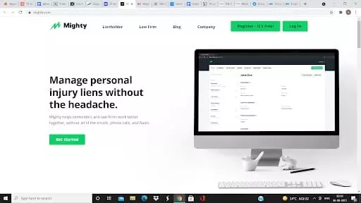
People want simple solutions to their problems. Mighty has worked hard to achieve exactly that. Their software has simplified the management of personal injury liens- a record of data and bills used by the lawyers and others involved in the medical industry. They promise to reduce the stress of emails, phone calls, and faxes in their copy. So it seems compelling enough to click the CTA button.
Conversion should be an easy step for the visitors. The more details you ask, the more reluctant the visitors feel to sign up. The landing page of Soundstripe has an enticing copy followed by the signup button.
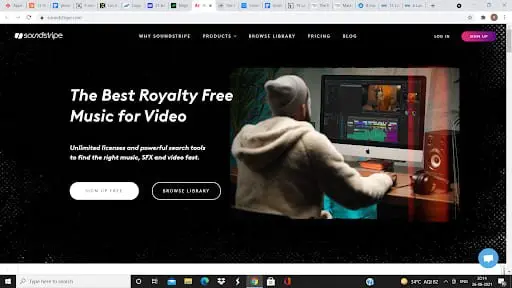
It is difficult to find royalty-free music online. Soundstripe offers a huge collection of royalty-free music for those who need it at a fair price. Everything seems well organized virtually. If you don’t feel like signing up right away, you can even browse their library to make a judicious decision. Either way, their landing page makes it irresistible to click the action buttons.
The landing page of your website should focus mainly on the CTA. If you are planning on a minimal design and are dubious about it then take a look at the landing page below-
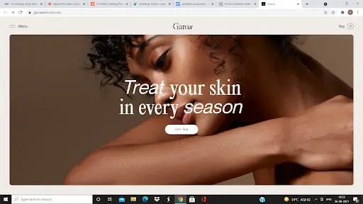
Garoa Skincare is an elegant website that provides skincare solutions. The website mostly relies on the images to bring in conversions and it is fairly good at it. The best part of this website is that its functionality is not hampered by the number of images it uses.
The word ‘free’ has still not lost its magic. Enticing people by giving them free things along with smart and effective solutions to their problems is a great way of increasing traffic.
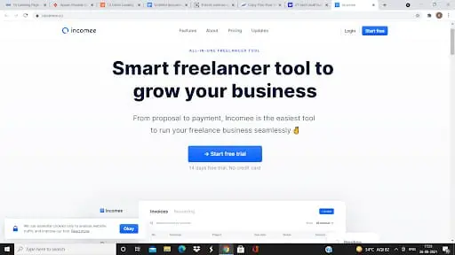
Incomee keeps a check on your finances. But not in a creepy way. It helps you to spend responsibly by tracking your finances. The CTA offers a free trial which would help people in trusting them. They have also mentioned that the trial is free for 14 days. And there is more- they don’t need your credit card details. The heart-warming line- “no credit card” just makes it irresistible to click that CTA.
A video on your landing page can show a lot about your business. For instance, Antidote is a creative agency that claims to offer a meaningful difference in the success of its clients and long-term branding.
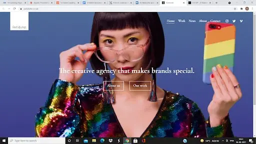
Antidote has used a video to encourage CTA. Their video is a compilation of various brands they have crafted. This video stands as an example of their creativity and excellence.
By now you would have realized the do’s and don'ts while designing the best landing page. So go ahead and develop your idea! Hopefully, this post would have helped you in finding some inspiration. If you are still not sure to get on with this task on your own, you can take help from several landing page builders for an optimized solution.
Anuja is the Co-founder and CEO of RedAlkemi Online Pvt. Ltd., a digital marketing agency helping clients with their end to end online presence. Anuja has 30 years of work experience as a successful entrepreneur and has co-founded several ventures since 1986. She and her team are passionate about helping SMEs achieve measurable online success for their business. Anuja holds a Bachelors degree in Advertising from the Government College of Fine Arts, Chandigarh, India.
Leave your comments
Post comment as a guest