Tableau has taken the data visualization world by storm, and for good reason.
Beautiful and complex visualizations, dashboards, and reports can be created quickly and without any coding experience within its user-friendly interface. Tableau is particularly useful for the creation of interactive visualizations, as filters can be added to a single visualization or full dashboard with just a few clicks. However, Tableau is limited in its analytic capabilities. The calculated fields feature allows for simple measures such as means, sums, and date differences to be calculated, and Tableau has some built-in features for adding regression lines or identifying clustering. For any sort of advanced analyses, however, Tableau falls short.
R, on the other hand, was created by statisticians and therefore has extraordinary analytic capabilities. Between its built-in functions and those contained within the seemingly endless list of available packages, there’s little that you can’t do in R from an analytic standpoint. However, visualization in R presents more of a challenge. The development of packages like ggplot2 and plotly has significantly advanced R’s data visualization abilities, but these packages are still not as easy to use as Tableau’s interface. It takes a fair amount of coding ability to build a well-designed, interactive dashboard or visualization in R. Even for those with coding expertise, it is simply much more time-consuming to write R code to make one plot in a dashboard act as a filter for others, to add explanatory text, to restructure your data for a particular visualization (which often isn’t even necessary in Tableau), to resize graphs in a dashboard, to apply color, or to accomplish any number of other tasks which can be quickly accomplished in Tableau’s drag-and-drop environment.
Fortunately, Tableau is able to connect to R, enabling users to reap the benefits of both tools at once. To demonstrate this process and its usefulness, I will walk through a sample regression analysis conducted using R code and Tableau visualizations.
Step 1: Set up a Connection between Tableau and R
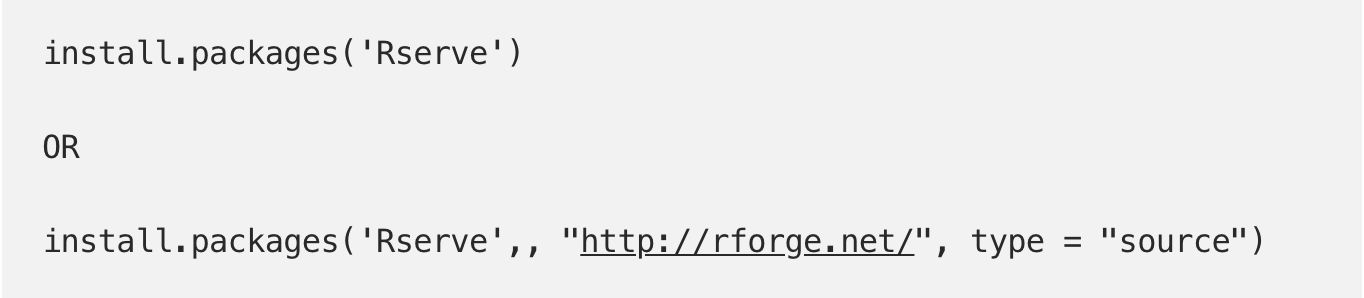
In order for R and Tableau to be used together, a connection has to be set up using the “Rserve” package.
First, install the “Rserve” package in R. The first code option is simply the standard code for installing R packages from CRAN. I am also including code for installing the “Rserve” package from RForge, as the CRAN install has frequently given me errors.
Next, just load the newly-installed “Rserve” package:

The only other step that needs to be taken in R is to run the following command, which sets up a socket server and allows requests to be sent to R:

Rserve should now be working, so let’s switch over to Tableau.
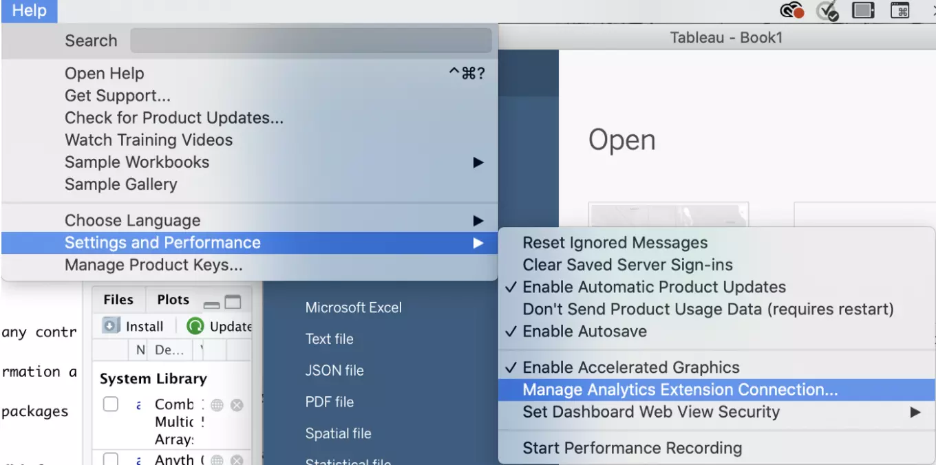
Under “Help,” click “Settings and Performance” and then “Manage Analytics Extension Connection”:
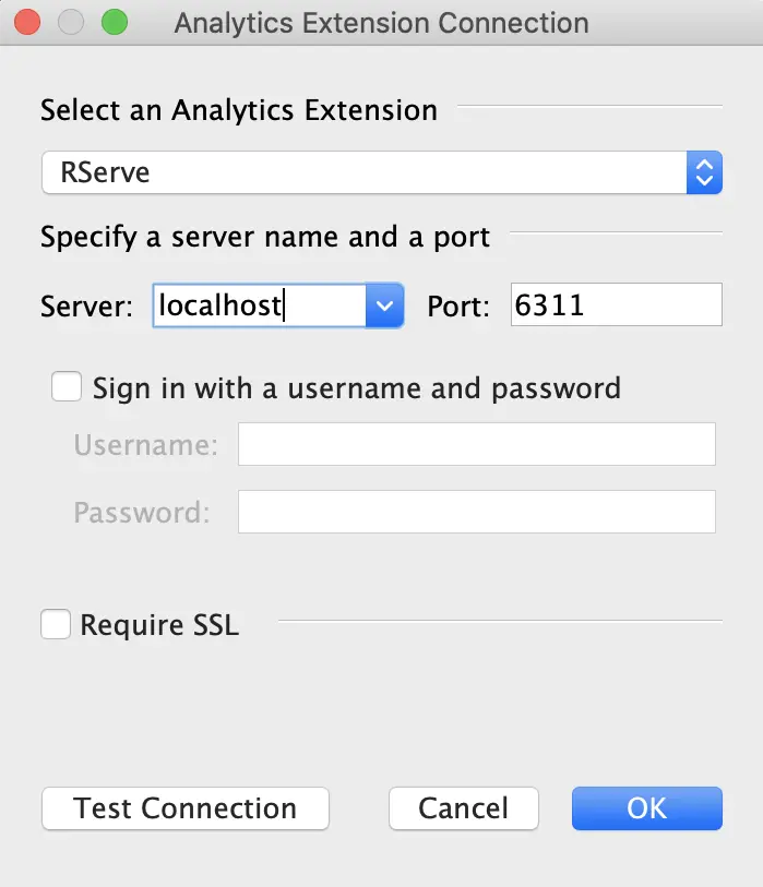
The following “Analytics Extension Connection” window should open. Select “Rserve” as the Analytics Extension, as well as “localhost” for server and “6311" for Port. Once that’s all entered, click the “Test Connection” button in the lower left corner of the window:
After you click the Test Connection button, you should receive the following message indicating that your connection has been set up successfully:
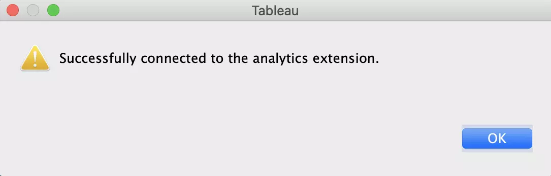
If you receive this message, then you’re good to go. We will be staying in Tableau for the rest of this tutorial, although we will need to keep R running to maintain the connection.
Step 2: Run the Regression Analysis
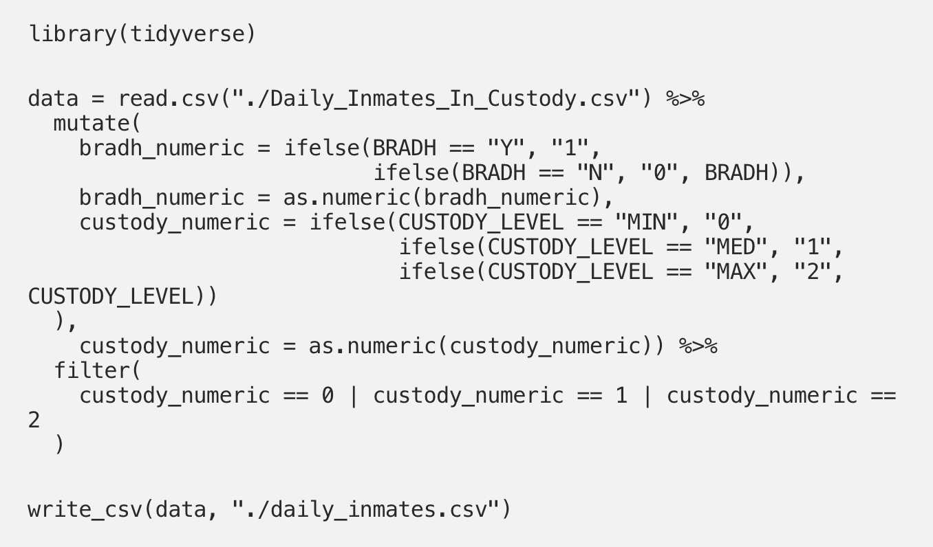
The data that I will be using in this tutorial come from NYC OpenData and represent inmates in custody in New York City. Included variables represent attributes such as mental health designation, race, gender, age, custody level, legal status, sealed status, security risk group membership, top charge, and infraction flag. The data are publicly available and are available for download here.
I’m curious as to whether or not custody level (minimum, medium, or maximum) predicts whether or not an individual has a mental health designation, and will create a logistic regression model with mental health designation as my outcome and custody level as my predictor. Before setting up a connection to Tableau, I used the following R code to prepare these data and to write a csv file containing the cleaned data:
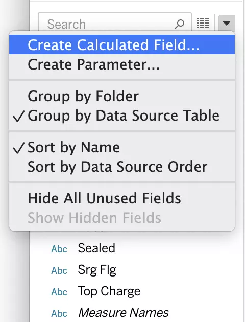
Once this file is connected to Tableau (in Tableau, click “Connect to Data,” select “Text File,” and navigate to your csv), we will use a calculated field to create our regression model. Select “Create Calculated Field” from the drop-down menu in the Data panel:
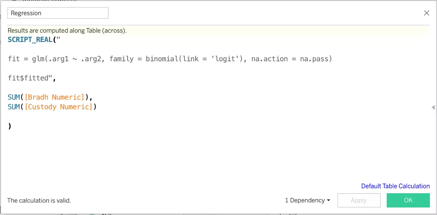
I’ve named my calculated field “Regression.” Within the SCRIPT_REAL() calculation function, you can enter your code for analysis in R. If you’re familiar with using logistic regression models in R, then the code below will look extremely familiar. The important difference to get used to in Tableau is that instead of entering your variable names directly into your glm() function, “.arg” placeholders are used and the variables are specified below the glm() code (see Bradh Numeric and Custody Numeric). It’s a bit unintuitive to adjust to at first, so I recommend also running your analysis in R the first few times so that you can check your work.
If your calculation can be completed, you will see “The calculation is valid.” in the bottom left corner. If you’re receiving this message, go ahead and hit the green “OK” button.
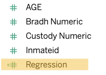
You will now see your calculated field (indicated by the equals sign before the #) with your numeric table elements on the left-hand side of your screen.
Step 3: Visualize and Explore your Regression Results
First, let’s just visualize the fitted values for the three custody levels included in our analysis by dragging the “Custody Level” pill to Columns and the “Regression” pill to Rows. I’ve also added “Custody Level” under Color:
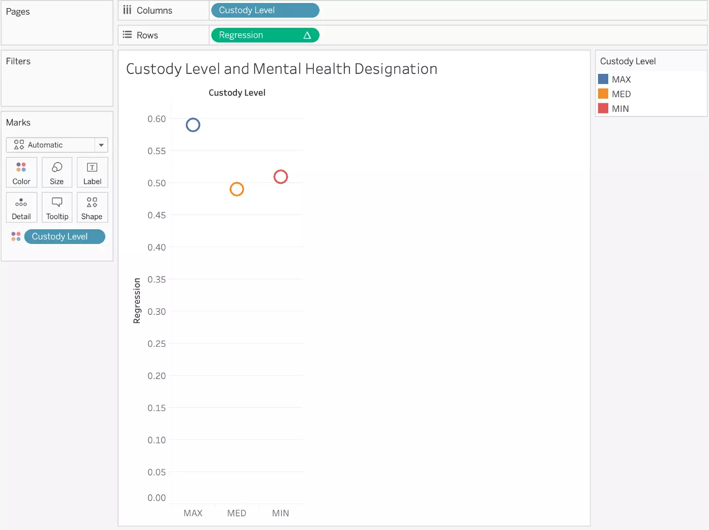
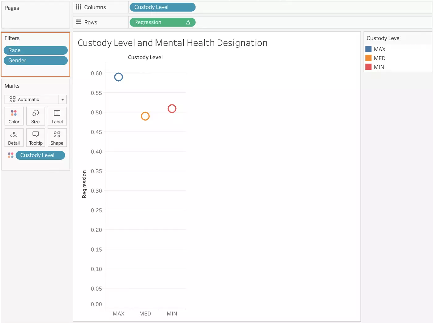
These fitted values are hovering around 0.5, indicating that custody level isn’t a great predictor of an individual’s mental health status. But here’s where Tableau really shines. Let’s say that we want to see how this relationship differs based on race and gender. In R, answering this question would involve adding race and gender to our regression model and figuring out fitted values for particular groups of people based upon the resulting coefficients. In Tableau, however, we can simply add these variables as filters to our visualization and interact with the product to see where the relationship is more interesting.
Drag the “Race” and “Gender” pills into the Filters box, as shown below:
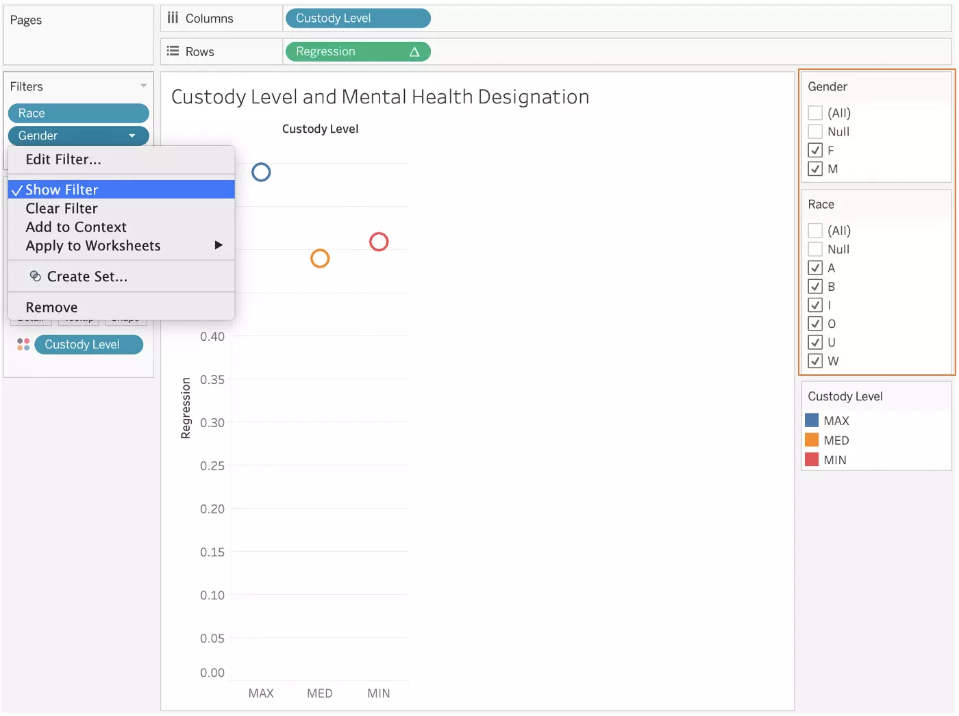
In order to interact with these filters, right-click on the filter pills and select “Show Filter.” You’ll see the filters appear on your screen:
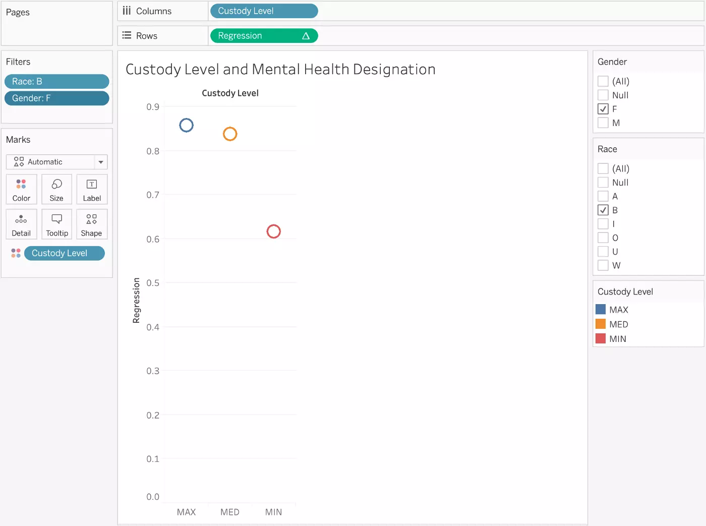
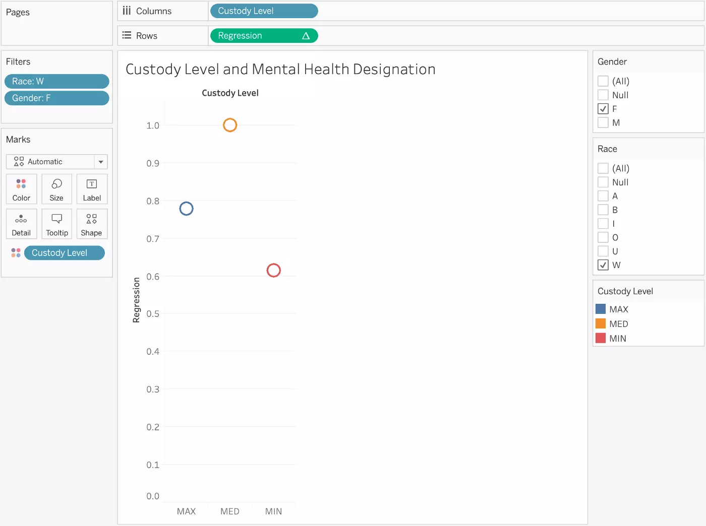
When all of the boxes are checked, the regression fitted values remain unchanged because the entire sample is still included in the analysis. By selecting certain boxes, however, it’s easy to instead see the relationship between custody level and mental health designation among Black women:
Or white women:
Or Asian men:
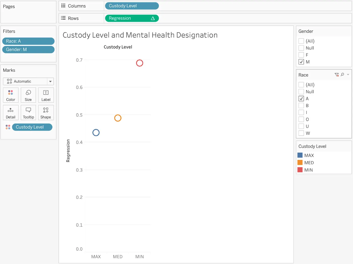
These filters make it easy to see that certain sub-populations do have meaningful relationships between custody level and mental health designation, and that these relationships are very different among varying racial and gender groups.
* Note: The data dictionary for this dataset does not provide descriptions of the included racial groups. I am therefore making assumptions about what the single-letter designations stand for. It is also unclear if the gender measure truly represents gender or if it’s really capturing sex.
Other Applications
In this example, we used a logistic regression analysis to answer an explanatory question (how does mental health designation differ by custody level, race, and gender?), and visualization served the primary purpose of exploring this relationship. Similar approaches could be taken with other analytic techniques such as k-means clustering, as Tableau’s visualization capabilities provide a useful means of exploring how your clusters change within different subsets of your data.
However, the integration of Tableau and R has so much potential beyond simple exploration. For example, integration of these tools is particularly useful for geospatial analyses given that Tableau truly excels at producing maps but lacks this advanced analytic ability. Additionally, these tools can be used together to better visualize predictive analyses such as linear regression or time-series analyses. Projects that require advanced analyses of really any sort, as well as complex and interactive visualizations and dashboards, would likely benefit from the combined capabilities of both Tableau and R.
The strengths of Tableau and R complement each other well, and learning how to use them together can maximize your efficiency while simultaneously enhancing your data visualization products.


Leave your comments
Post comment as a guest