Comments
- No comments found

Income inequality can be viewed from different perspectives.
I sometimes say that I feel as if I have a pretty good grasp on the US economy–except that my understanding has about a 2-3 year lag.
For example, right now I feel as if I’ve got a pretty good understanding of events up through about May 2020, but I’m still trying to develop a satisfactory understanding of what has happened since then.
When it comes to inequality of household incomes, the Congressional Budget Office is on a similar timeline. CBO has just published The Distribution of Household Income, 2019 (November 2022). But CBO has a better excuse for the time lag than I do. A good chunk of the underlying data behind this report is from income tax data. This data has the great advantage that is isn’t from a survey asking people about their incomes, but is from what people actually filed with the Internal Revenue Service, with in turn is cross-checked with data from employers, financial institutions, and other types of income (like royalty payments). But data for 2019 incomes doesn’t get sent in until 2020, and the pandemic led to delays on when taxes were due. Thus, anyone working with full tax data is always a couple of years behind the times.
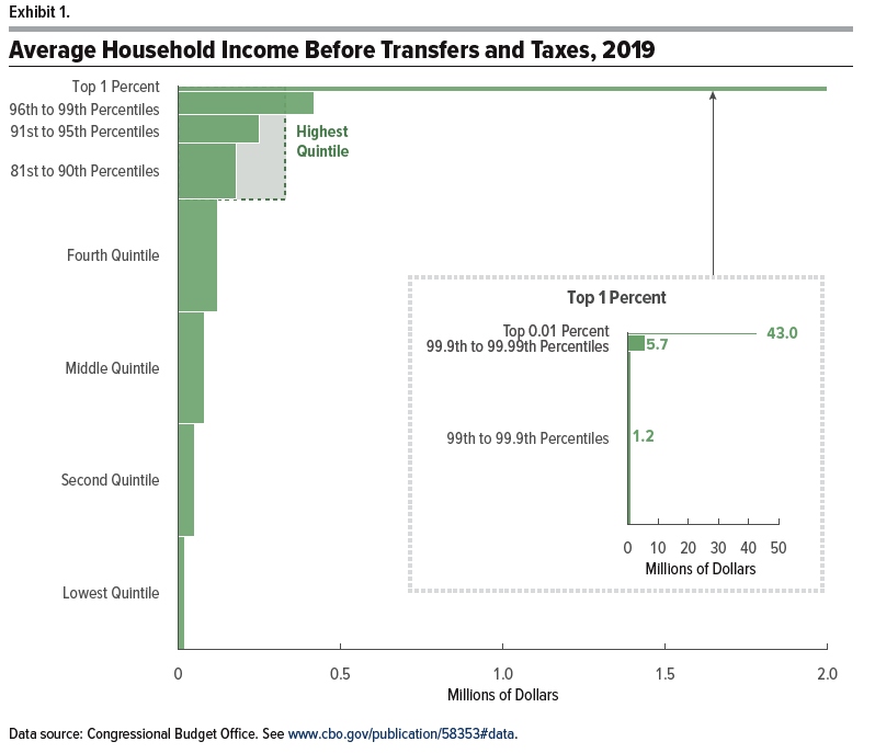
The real strength of the report is not that it is up to the minute, but rather that it offers a snapshot in time along with useful sense of trends in income inequality since the late 1970s, when it began to rise. Here are a few of the graphs that caught my eye. This is a snapshot of inequality across income levels for 2019. The breakout panel on the right shows that while average income for the top 1% was about $2 million, this breaks down into average income of $1.2 million for the 99 to 99.9th percent (that is, the top 1% not including the top 0.1%), average income of $5.7 million for the 99.9 to 99.99th percent (that is, the top 0.1%, not including the top 0.01%), and average income of $43 million for the top 0.01%.
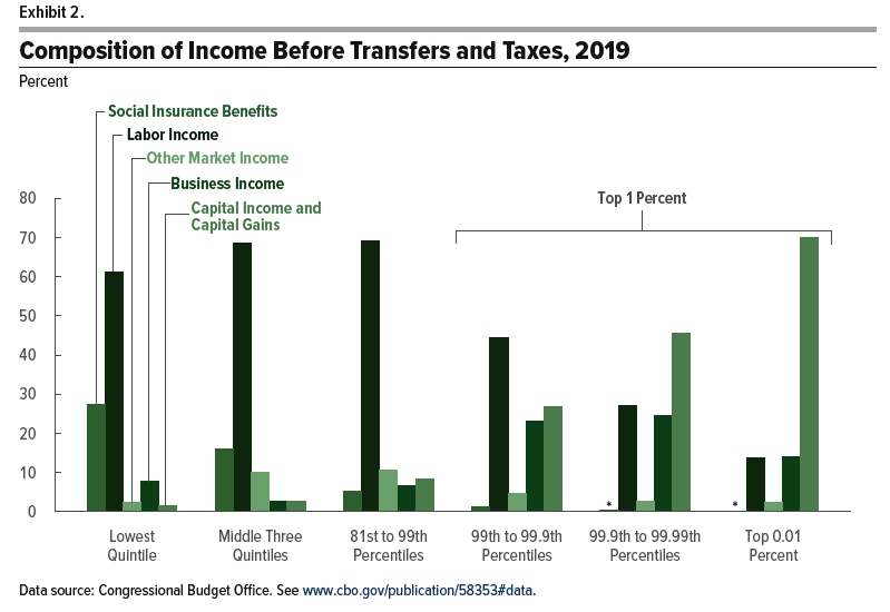
This figure shows where the income comes from for each group. In particular, the black lines show that the highest share of income is from labor income–that is, being paid for work done in the previous year–for everyone up to the 99.9th percent. For the very tip-top, capital income and capital gains (think rising prices of assets like stocks and real estate) are the biggest share.
It’s easy to gabble about whether inequality is too high or too low, but many people are better gabblers than I am, so I won’t do that here. It’s perhaps worth saying that no one should expect income levels to be equal in a given year, for the same reason that there’s no reason for a 19 year-old high school dropout to be earning the same income in a given year as a 50 year-old physician–or someone who started a company that hires dozens or hundreds of people. In addition, most people move between income levels over time as their skills and experience and savings increase.
But the CBO is a just-the-numbers organization. Thus, the report is a place to get information about the degree of redistribution of income in the US, and how that has evolved over time.
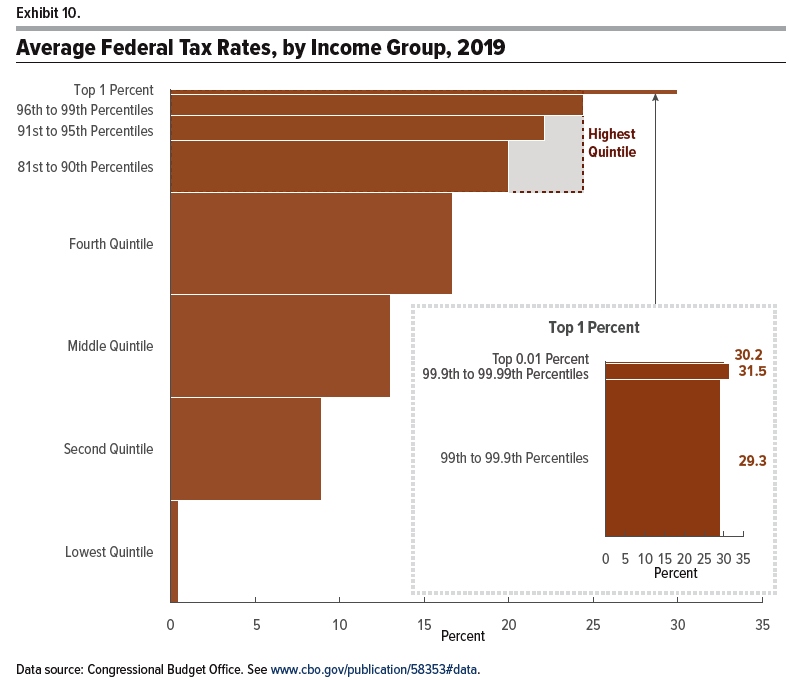
For example, here’s a figure showing average federal taxes by income group: this measure included all federal taxes (say, including payroll taxes for Social Security and Medicare), but does not include state and local income or sales taxes.
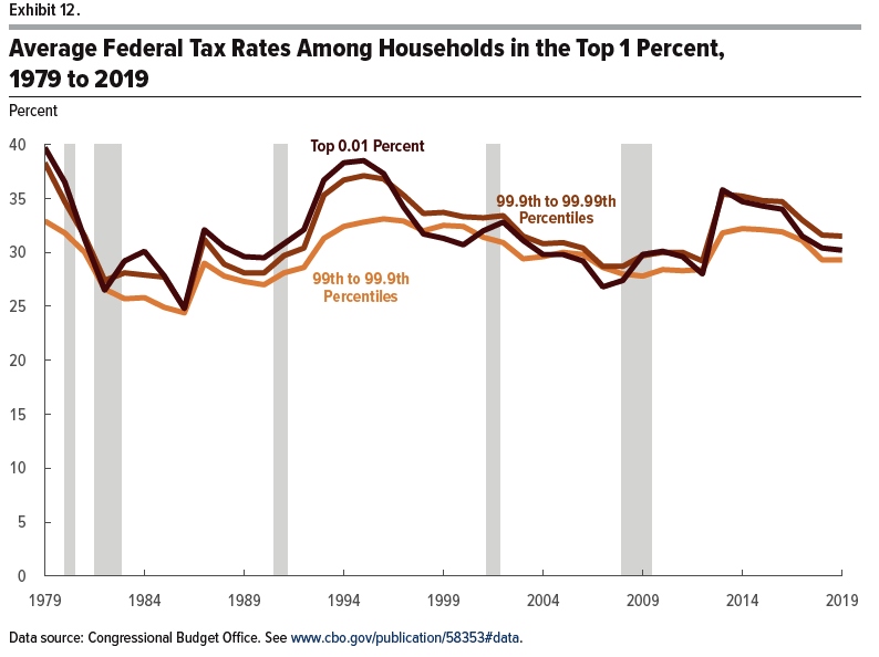
Here’s the trend in average federal taxes paid at the top of the income distribution in the last 40 years or so. You will notice that while the subject has been the source of considerable political controversy, the ups and downs have pretty much levelled out over time.
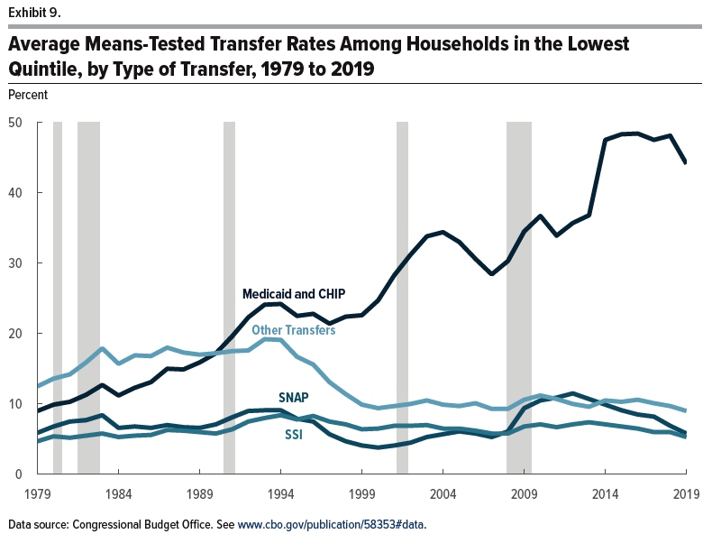
This figure shows trends in what household in the lower quintile of the income distribution receive in federal redistribution programs. Notice that assistance in the form of Medicaid has risen substantially, but of course, Medicaid can’t be used to pay the rent or buy groceries. The other main transfers–Supplemental Security Income, food stamps (SNAP), and “other”–have been flat or trending down.
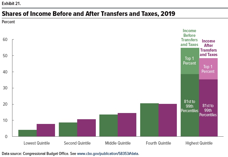
So with federal taxes and benefits taken into account, how much redistribution happened in 2019? The fiture shows the share of income for various groups before and after taxes and spending. The CBO writes: “The lowest quintile received 8 percent of income after transfers and taxes, compared with 4 percent of income before transfers and
taxes. … In contrast, the share of income after transfers and taxes for the highest quintile was about 6 percentage points less than the share of income before transfers and taxes. Because those households paid more in taxes than
they received in transfers, the transfer and tax systems combined to reduce their share of income from 55 percent to 48 percent. Much of that decline was experienced by households in the top 1 percent of the distribution, whose share of income after transfers and taxes was 13 percent, 3 percentage points lower than their share of income before transfers and taxes.”
The Gini coefficient is a standard way of compressing the distribution of income into a single number. The Gini ranges from 0 to 1, where a Gini of 0 would imply a completely equal distribution of income, and a Gini of 1 would imply that a single person received all the income. Here’s the Gini for the US income distribution over time. You’ll notice that the top line, income inequality based on market incomes, is rising over time. However, the bottom line, which is income inequality after taxes and transfers, shows a Gini that has been essentially flat since 2000. The Gini in 2019 is higher than most of the 1970s and 1980s, but it’s similar in 2019 to the peak years over those periods, like 1986.
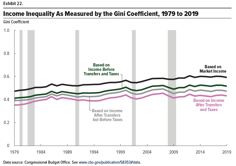
The overall pattern is that as market income has become more unequal, the forces of taxation and redistribution in pushing toward greater equality of after-tax, after-transfer income have become stronger over time, and since about 2000 those forces have broadly balanced each other out. Of course, nothing in these numbers is an argument that the US should not do more (or less) to redistribute. But the factual claim that after-tax, after-transfer income inequality has been rising substantially over time is often overstated–and is not true for the last two decades.
Timothy Taylor is an American economist. He is managing editor of the Journal of Economic Perspectives, a quarterly academic journal produced at Macalester College and published by the American Economic Association. Taylor received his Bachelor of Arts degree from Haverford College and a master's degree in economics from Stanford University. At Stanford, he was winner of the award for excellent teaching in a large class (more than 30 students) given by the Associated Students of Stanford University. At Minnesota, he was named a Distinguished Lecturer by the Department of Economics and voted Teacher of the Year by the master's degree students at the Hubert H. Humphrey Institute of Public Affairs. Taylor has been a guest speaker for groups of teachers of high school economics, visiting diplomats from eastern Europe, talk-radio shows, and community groups. From 1989 to 1997, Professor Taylor wrote an economics opinion column for the San Jose Mercury-News. He has published multiple lectures on economics through The Teaching Company. With Rudolph Penner and Isabel Sawhill, he is co-author of Updating America's Social Contract (2000), whose first chapter provided an early radical centrist perspective, "An Agenda for the Radical Middle". Taylor is also the author of The Instant Economist: Everything You Need to Know About How the Economy Works, published by the Penguin Group in 2012. The fourth edition of Taylor's Principles of Economics textbook was published by Textbook Media in 2017.
BBN Times connects decision makers to you. Experts in their fields, worth listening to, are the ones who write our articles. We believe these are the real commentators of the future. We quickly and accurately deliver serious information around the world. BBN Times provides its readers human expertise to find trusted answers by providing a platform and a voice to anyone willing to know more about the latest trends. Stay tuned, the revolution has begun.
Leave your comments
Post comment as a guest