Comments
- No comments found

There's a thin line of difference between glance and glimpse.
Frankly, it's a deliberate choice. The information you put on a screen either gets noticed or ignored. The real constraint is time. Not hours, not minutes, but we are fighting for seconds. With human attention span on a decline, things are more challenging than ever.
A 2005 study on outdoor advertising showed respondents spend no more than 200 milliseconds looking at a particular sign. That's only a fraction of a second! As humans, we are becoming horribly impatient. For a digital sign manufacturing business, the biggest issue is distraction. And it has to do with the number of elements on the screen. The more, the worse. So, how do you make an impact? Here's everything you need to know to answer that million-dollar question.
Any viewer needs minimum time to read the money message. As a brand, you have anywhere between 1-3 seconds to grab attention and retain it to 6-8 seconds long. If you're in motion, it's even more tricky. Because the human brain will need twice the time to process information when it's still compared to when it's moving, you must design digital signage with static key information.
Take news crawl, for instance. They remain a dominant way to reinforce information. However, when news tickers don't match what's shown on the screen, it affects things negatively. Thus, viewers tend to forget things a lot faster.
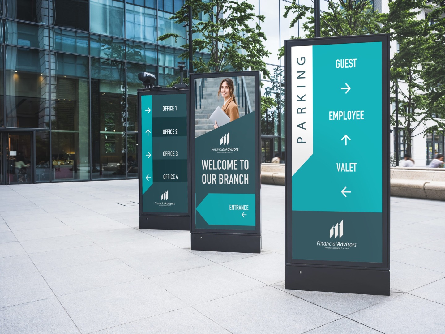
Most brands place their digital signage in high-traffic areas. But, they must understand that the potential audience will never be static. So, the key message needs to be passed within a few seconds. Here’s what all you need to consider:
Pay attention to the display resolution. Remember, the more pixels, the better the picture. A higher number of pixels also means your image will have more clarity. Some of the standard pixel dimensions for digital signage are 960/540 pixels (quarter HD), 1280/720 pixels (standard HD), 1920/1080 pixels (full HD), and 3840/2160 pixels (ultra HD).
Next, consider the font size. It should neither be too small nor too big. Typically, digital signage is viewed from a distance of 7-10 feet. So, choose a font that’s easy on the eyes, like Helvetica, Arial, and Verdana. For size, keep it at 20-30 points if your digital signage is to be viewed from a distance of 7. If you want people to see your digital sign from more than 20 feet away, the font size must be at least 100 points.
The idea is to hook the customer from the first glance. So, you must keep critical brand messages short and to the point. Storytelling is good. But a quick reality check will tell you there's little time to build a story. That's why you need to create functional headlines.
The material for signage also plays an important role. Acrylic, aluminum, and vinyl are popular choices but distinctly different. Other options to consider include wood and plastic.
What a potential customer sees in a digital signage directly impacts his next action. So, if the design is overwhelming or too hard to process, the brain will stop absorbing information. That's how it works. Here's what you need to do to make it count.
Remember, less is more. So, don't fill a digital signage space with too many elements and information.
Consider every word as a precious gem. If you think a word or a line doesn't make sense, get rid of it once.
Your visual elements shouldn't distract audiences from reading the key information. Tone down things if needed.
Always stick to delivering the key message. If you find something that's not a part of the key message, do away with it.
A digital signage zone can have multiple content zones. But, experts believe more than one zone calls for adverse impact. Keeping thighs to one content zone cuts through the visual clutter. Thus, it reaches the right audience at the right time. No fluff, straight-to-the-point brand messaging can win places. And it's not a choice but a necessity for a brand to survive.
BBN Times connects decision makers to you. Experts in their fields, worth listening to, are the ones who write our articles. We believe these are the real commentators of the future. We quickly and accurately deliver serious information around the world. BBN Times provides its readers human expertise to find trusted answers by providing a platform and a voice to anyone willing to know more about the latest trends. Stay tuned, the revolution has begun.
Leave your comments
Post comment as a guest