Comments
- No comments found
Search is a crucial element of user experience (UX) and an important piece of the search experience.
Search results are helpful because they provide users with a view from what they can find and teaches them about the structure of a website.
It's necessary to take preventive measures to avoid general mistakes when it comes to displaying user experience.
Because search is so advanced and straightforward in modern reality, it’s more than essential to understand that your search results should be not only aesthetically pleasing but engaging and highly practical for users. Furthermore, it means that search results should coincide with the client’s expectations and be highly relevant. So how a search results page should look, and what are the main points of implementation of search results display methods?

Search results are increasingly central as websites grow in size and complexity. Search is essential on websites that provide a service through information delivery including news portals, or a product such as bookings for flights, vacations and deals.
Here are the best practices you need to keep in mind while desining a search form for your website:
Search results should begin with creating a form. Here are the most crucial steps:
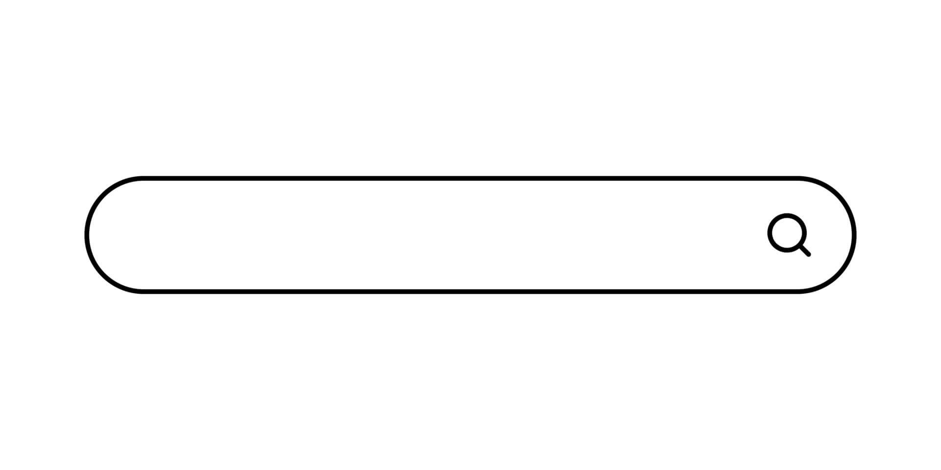
The first step to creating an efficient search result is to make it visible to users. According to research, clients hope to see the bar in the upper right corner and get confused when the bar is placed lower/to the left. It could mess up the user experience, and even if you wanted to put a bar somewhere at the bottom of a page for unclear reasons, alas, you don’t create the rules here. Navigation elements are associated with the right side of the screen – that’s what people were taught to do. Here you can also review the split screen templates.
For the majority of sites, you can create the following steps: make a site dedicated to resolving a problem or answering a question, such as a Wiki page or a data report, and find an appropriate place for your results.
It’s best not to hope the user will decode the meaning behind the icon as it takes too much time. Researchers support this idea because besides magnifying glass icon popularity, using only images for clues tends to slow down the searching process. So again, add some text to your icons to show users WHAT they can find on your site.
The window should be spacious enough to display a middle-length request. It becomes challenging to type in something you cannot see. If you have a little space, just toggle the interactive part so that it gets bigger every time the user places their mouse on a search bar.
Because most users understand that clicking the mouse is slower than tapping on the Enter key, many beginner clients don’t know that these features work similarly. Therefore, the search should maintain both clickings on the screen and touching the Enter bar. The designer should think about every market and not forget that many middle-aged users don’t use a keypad as a substitute for screen buttons.
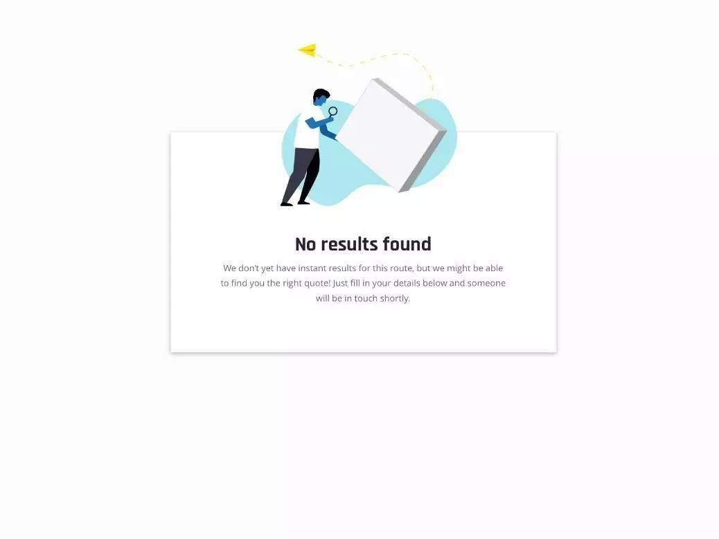
Every well-known designer understands that the absence of a search result is a search result in itself. The main idea is that leaving a blank page is insufficient. It’s much better to present the alternative. In many interfaces, empty space is just the start of your creative process. Why not create a new document instead of complaining that the page is not found? Instead of presenting a client with an empty page, state that the result was not found. Don’t blame the user for not typing the request correctly. Instead, present them with the following step as an alternative. Even a link to a home page would be sufficient. That’s what Google calls “the best match.”
A well design search bar provides users the ability to narrow their options and find what they want through one search query. Providing user friendly controls empowers users to narrow down a large set of results to a small set that meets their exact criteria. Giving users more than one option to display results creates a more flexible experience that can attend meet the needs and expectations from different users.
BBN Times connects decision makers to you. Experts in their fields, worth listening to, are the ones who write our articles. We believe these are the real commentators of the future. We quickly and accurately deliver serious information around the world. BBN Times provides its readers human expertise to find trusted answers by providing a platform and a voice to anyone willing to know more about the latest trends. Stay tuned, the revolution has begun.
Leave your comments
Post comment as a guest