Comments
- No comments found

Whether you’re launching a new site or revamping an old one, this guide’s got your back.
You’ve spent hours crafting your website content, meticulously selecting images, and ensuring everything’s responsive.
But there’s a piece of the puzzle you might be overlooking: your website header.
It’s the first thing visitors see, and it can make or break their experience. Just as you wouldn’t neglect a first impression in person, you can’t afford to neglect the potential of this converting powerhouse.
The fact that visitors usually abandon a website in less than 15 seconds if it fails to grab their attention only highlights the need for implementing a compelling header.
We’re here to help with this issue. Dive in and discover how to maximize the impact of your website header, ensuring visitors not only stay but are also compelled to interact.
With countless websites competing for attention, your website header needs to not only attract but also differentiate you from the myriad of others.
Here’s how to ace this:
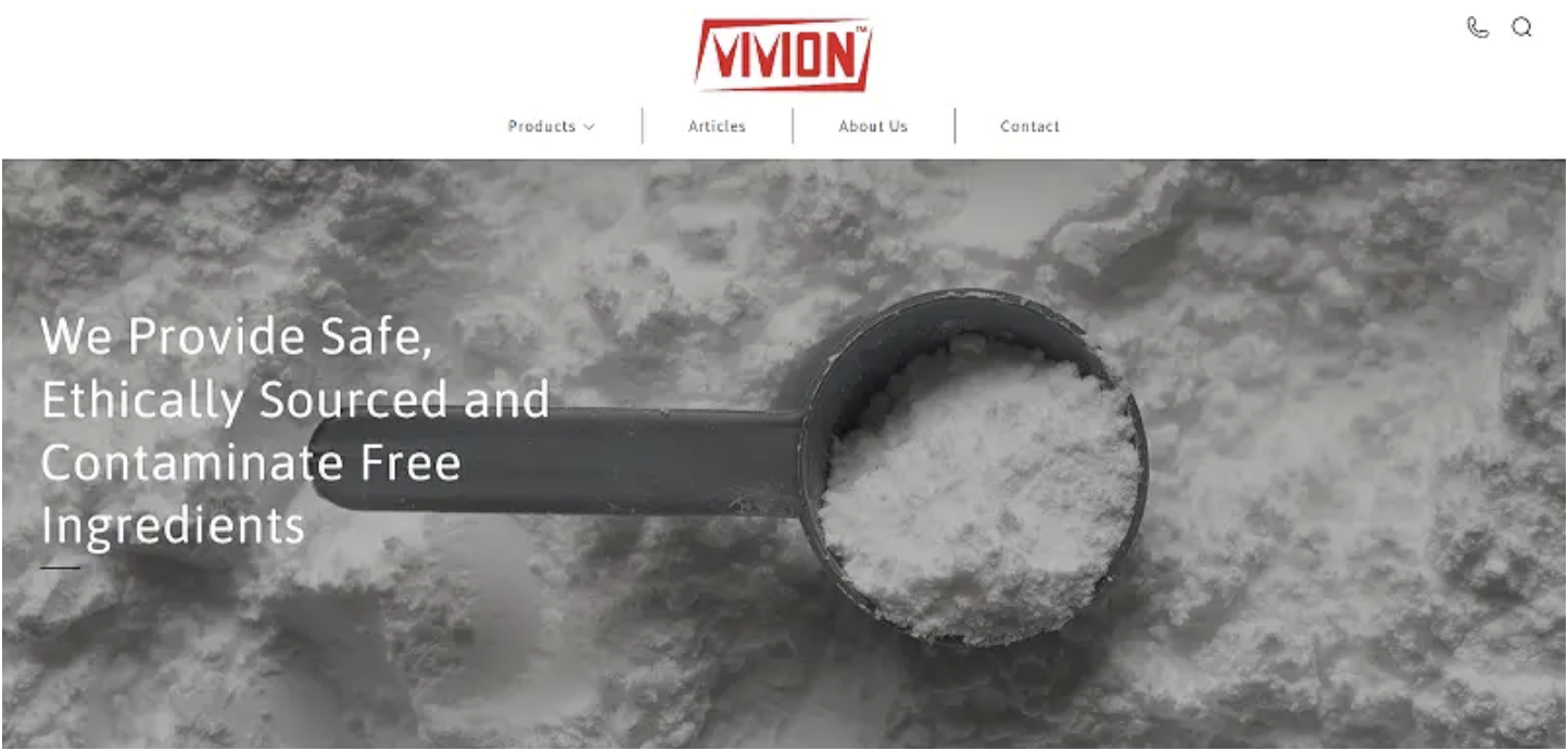
Vivion, an ingredients supplier, implements a website header that’s a masterclass in differentiation.
By clearly articulating their values and what they stand for, they effectively set themselves apart in a crowded market. When visitors land on their site, they instantly know what Vivion brings to the table that others might not.
Let’s break it down:
As you strategize your website header, consider this: What can you incorporate that vouches for your brand’s value? Sometimes, it’s not just about what you say – it’s enough to show what others are saying about you.
Social proof – evidenced through testimonials, star ratings, and endorsements – is a robust tool that can immediately elevate trust and build rapport. By leveraging this genuine support, you engage visitors and enhance the chances of converting them.
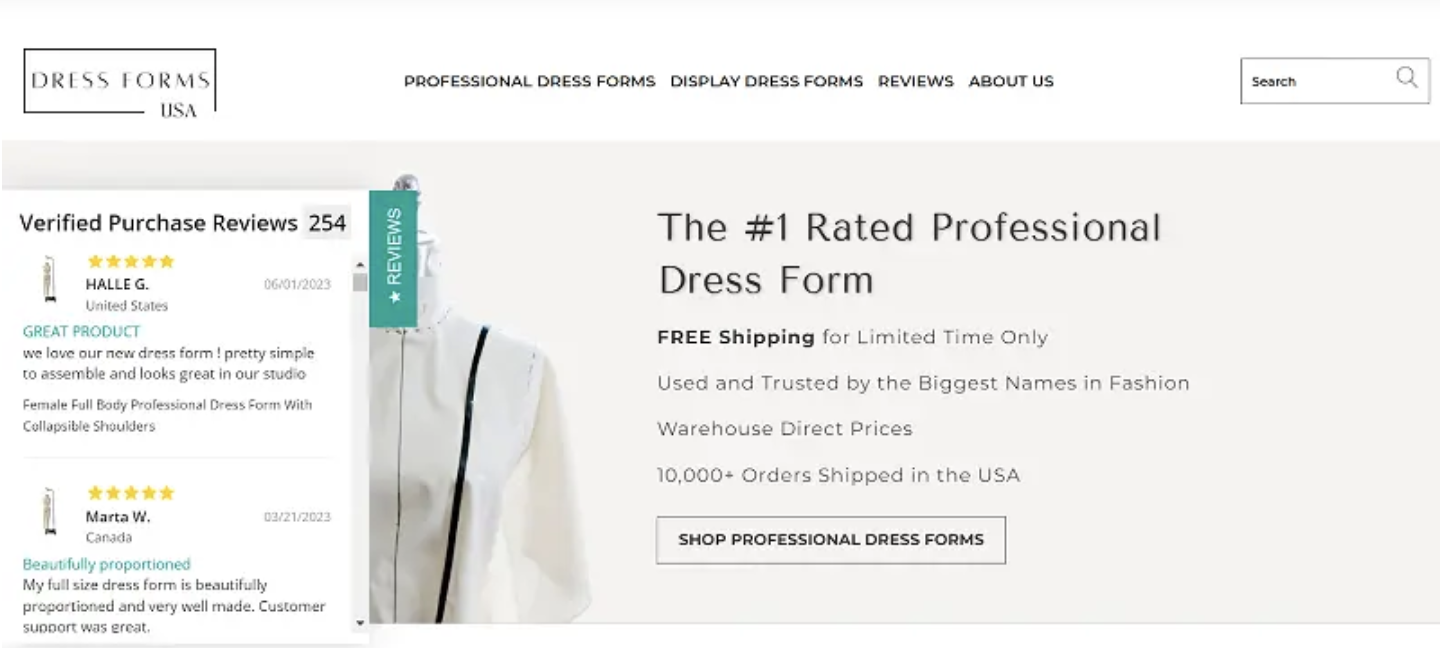
Dress Forms USA, a professional dress forms retailer, brilliantly employs social proof. They understand the weight of authentic voices and have integrated them seamlessly into their web design.
Their choice of featuring a sleek customer reviews flyout in the header immediately catches the eye.
Displaying genuine feedback from satisfied customers is their way of telling you they’re the best in the business.
But there’s more to it:
Positioning these reviews right at the top of the page is a strategic move. Before diving into product listings or company details, visitors get a taste of the positive experiences of past customers.
Well-crafted text and striking images will always have their place, but nothing grabs attention quite like a video. Explainer videos, in particular, can work wonders in presenting complex products or services in a digestible, engaging manner.
Here’s how to perfect this approach:
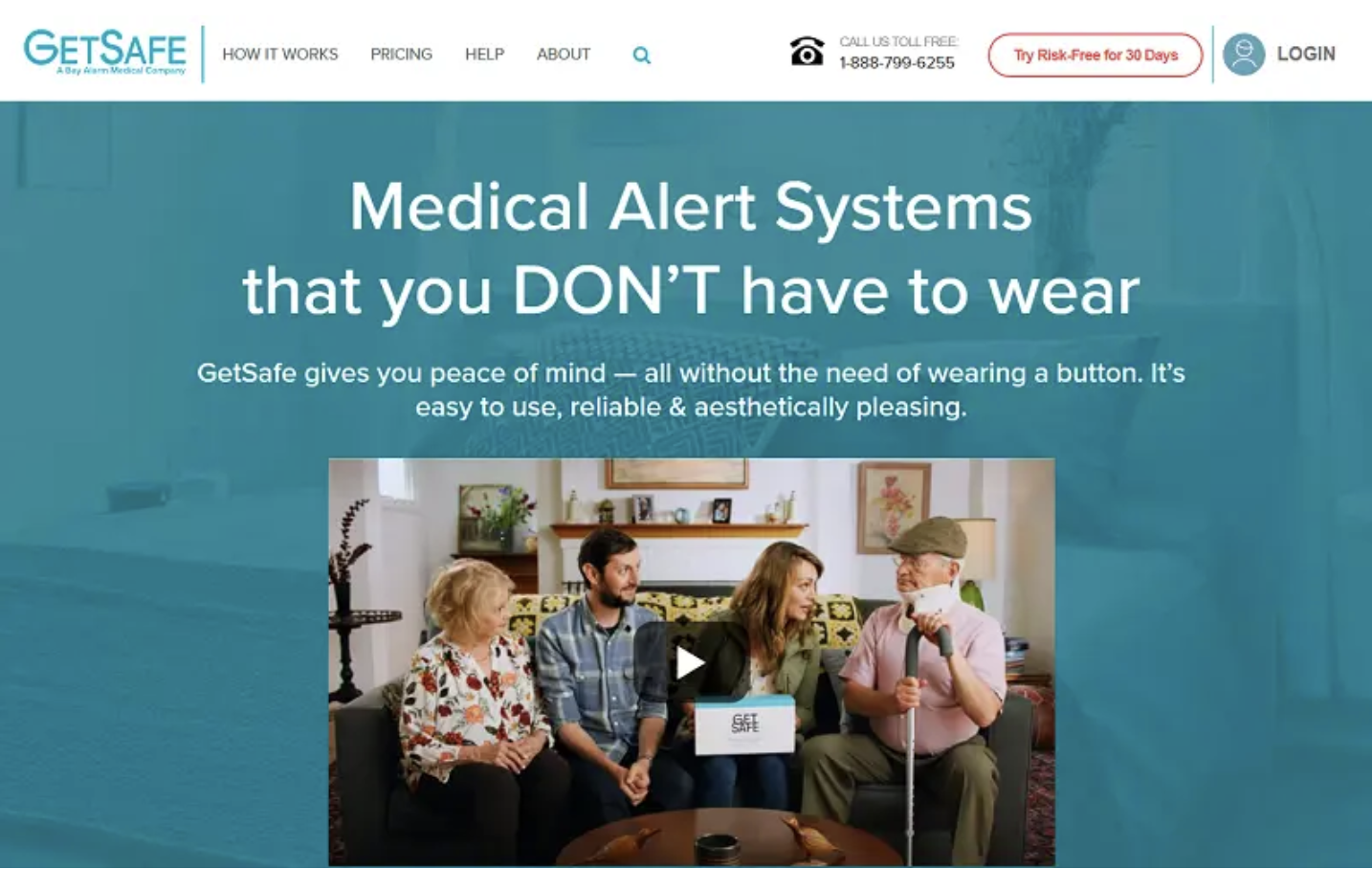
GetSafe, a pioneer in medical alert systems, exemplifies the power of a well-executed explainer video. Their video, prominently featured on their website header, is a testament to the efficacy of visual storytelling.
Their approach allows viewers to quickly grasp the product’s utility. Also, by showcasing scenarios that potential users can relate to, GetSafe fosters a sense of understanding. Viewers can easily envision themselves or their loved ones using the product.
This strategy is a shining example of how to seamlessly integrate product functionality with emotional resonance. Explainer videos not only educate but also connect, making potential customers more inclined to trust and invest in your solution.
With so much visual clutter around us, the appeal of simplicity can’t be overstated. Negative space isn’t just an absence of content. It’s a potent design element in its own right.
By consciously embracing and leveraging negative space, you can guide user attention, enhance comprehension, and elevate the overall user experience.
Here are a few tips for nailing this design principle:
Dribbble, the renowned hub for web and graphic designers, crafted its header with the philosophy of “less is more” in mind.
Key aspects of their approach:
CTAs are the beckon that leads visitors towards the desired action, be it signing up, purchasing, or just learning more.
To ensure your CTAs don’t get lost in the shuffle, they need to be bold, clear, and compelling.
Here’s your roadmap to crafting standout CTAs:
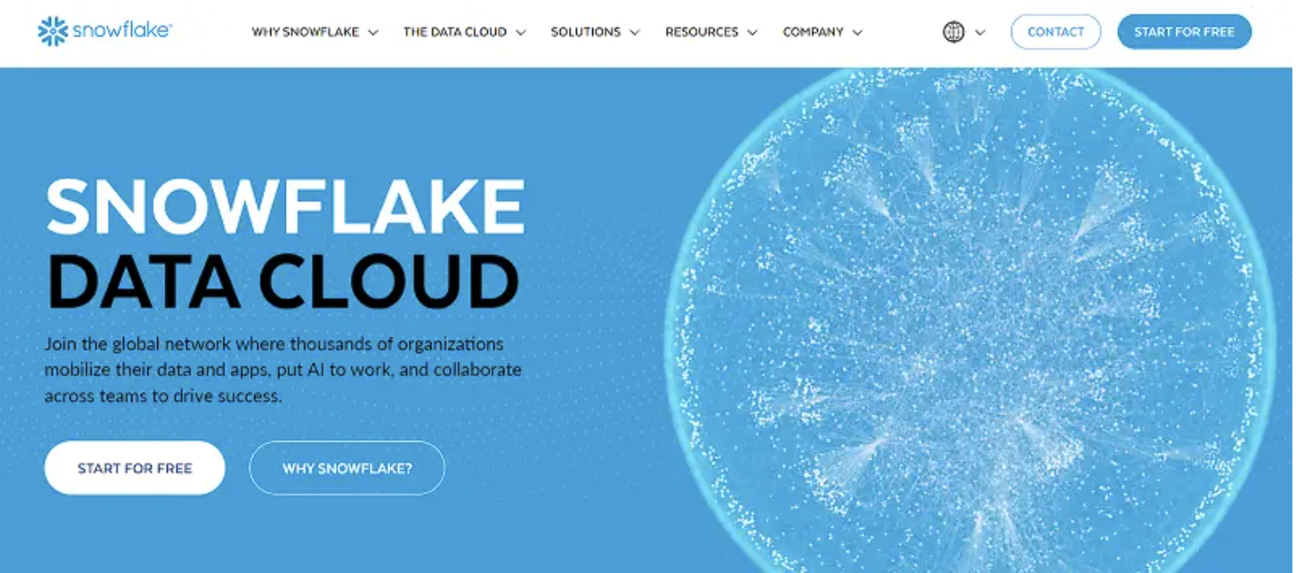
Snowflake, a leader in cloud-based data solutions, exemplifies the art of impactful CTAs. Their website header doesn’t shy away from guiding visitors decisively.
By offering two distinct CTAs – “Start for Free” and “Why Snowflake?” – the company caters to different user intents. Those ready to dive in can begin their journey, while the more cautious visitors have a route to learn more.
Each CTA is direct and to the point. “Start for Free” offers a no-risk proposition, while “Why Snowflake?” invites users to discover the unique selling points of their service.
This approach is a lesson in the power of clarity and choice. By presenting distinct paths clearly and boldly, Snowflake ensures that visitors are never left wondering what to do next.
Most users want to immediately understand the value a product or service offers. By placing a core functionality of your product front and center, you can instantly showcase its benefits, enticing visitors to delve deeper.
Nail this approach by doing the following:
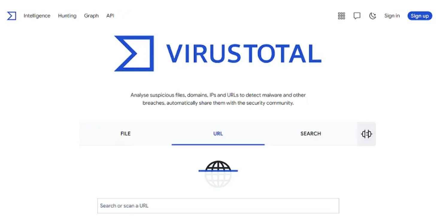
VirusTotal, a trusted name in online security, exemplifies this tactic with finesse. Rather than just talking about their malware detection capabilities, they’ve placed their free virus scanner prominently in the website header.
By offering immediate access to the scanner, visitors can instantly see the efficiency and thoroughness of VirusTotal’s tool.
Additionally, providing a core service for free not only showcases confidence in their service but establishes trust as well, as users can verify the tool’s effectiveness firsthand.
After users witness the scanner’s capabilities, they’ll be naturally intrigued about the advanced protection and features that premium services might offer.
VirusTotal’s strategy is a testament to the power of interactive engagement. By letting visitors experience a cornerstone of their service from the get-go, they effortlessly transition them from curious bystanders to potential premium users.
Crafting a captivating website header goes beyond the aesthetics. It’s a strategic move that can significantly boost user engagement and conversions.
From the elegant simplicity of negative space to the interactive attractiveness of core functionalities, every element plays a pivotal role. By embracing these tactics – be it through bold CTAs, compelling explainer videos, or firsthand product experiences – you’re curating a journey that guides, resonates, and, ultimately, converts.
As you venture forward, remember to keep your user at the heart of every design decision, and success will follow.
Anuja is the Co-founder and CEO of RedAlkemi Online Pvt. Ltd., a digital marketing agency helping clients with their end to end online presence. Anuja has 30 years of work experience as a successful entrepreneur and has co-founded several ventures since 1986. She and her team are passionate about helping SMEs achieve measurable online success for their business. Anuja holds a Bachelors degree in Advertising from the Government College of Fine Arts, Chandigarh, India.
BBN Times connects decision makers to you. Experts in their fields, worth listening to, are the ones who write our articles. We believe these are the real commentators of the future. We quickly and accurately deliver serious information around the world. BBN Times provides its readers human expertise to find trusted answers by providing a platform and a voice to anyone willing to know more about the latest trends. Stay tuned, the revolution has begun.
Leave your comments
Post comment as a guest