5 Most Effective Tips for Writing Mobile-Friendly Content

5 Most Effective Tips for Writing Mobile-Friendly Content

Anuja Lath 10/07/2019 4

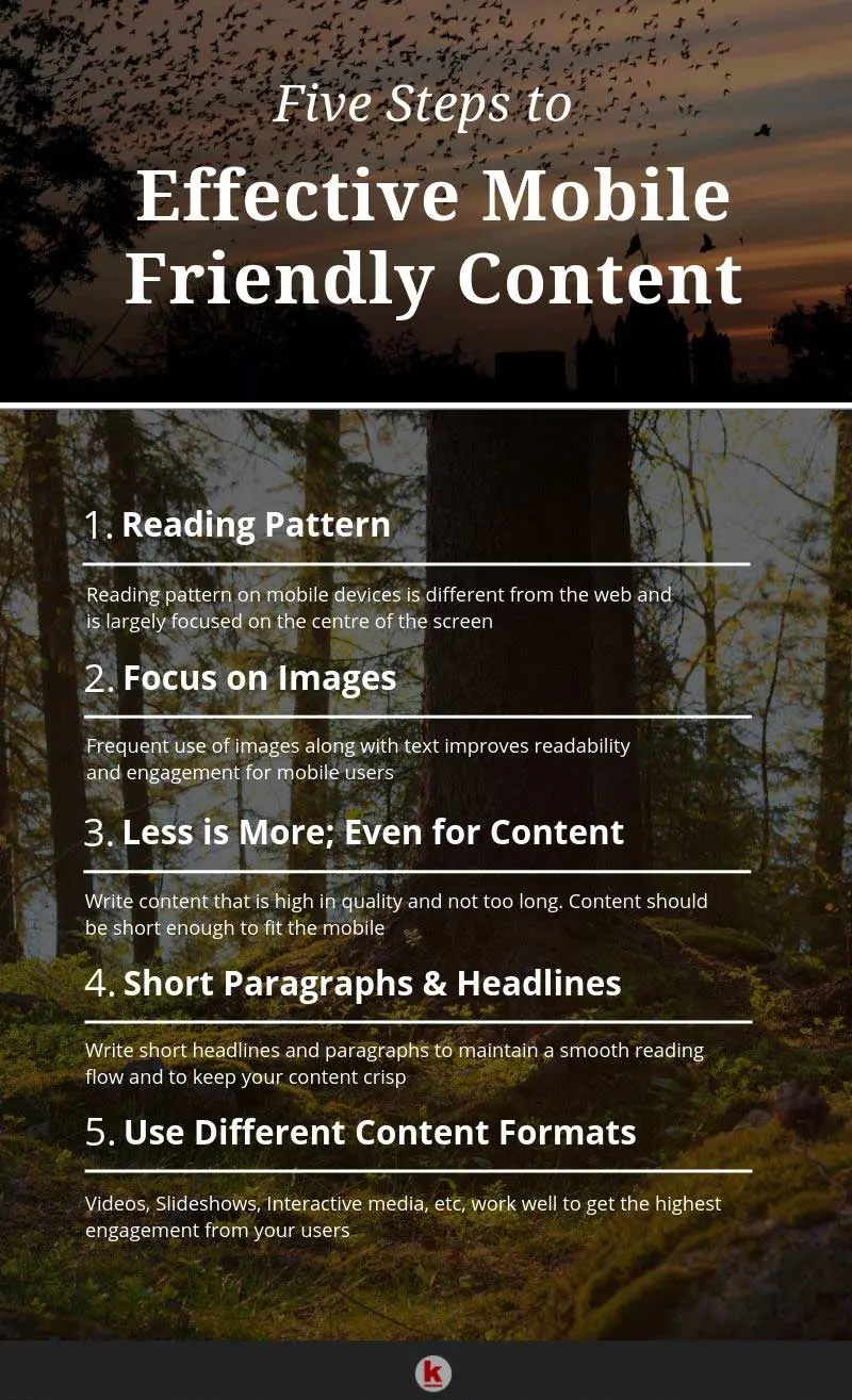
There is no doubt about the fact that a significant part of digital content is being viewed on mobile devices. The number of mobile readers has already outgrown the number of desktop-specific readers. No longer is responsive web design sufficient to cater to the needs of the mobile reading pattern, even if it may smoothly pass Google’s mobile-friendly test. You need to think deeper and work around all the aspects like text, videos, images, etc. which impact the user experience. Hence, mobile-friendly content will be truly appealing to mobile readers. Remember that you risk a high chance of losing your users if you are only focusing on responsive web design as your mobile strategy.

Vital Tips to Write Mobile-Friendly Content

  1. Reading Pattern: It is clearly a time to let go of old-wisdom that web readability is the same across all devices. The fact is that reading on a mobile device is way different from reading the same content on a desktop. The principle of the Golden Triangle which stated that most web readers usually view the upper right corner of the website. This inference was derived from the eye-tracking studies where the researchers found the most of the rapid eye movements were spanning a triangular region. Likewise, the F-shaped pattern which has been high-up on charts of the web reading studies has to be phased out. It was also derived from the eye-tracking studies which stated that the web users made the shape of an F while reading the content. On a mobile platform, the biggest fight is space and that is too less for vertical or horizontal sweeps.

    Instead, mobile readers are effectively focussed at the centre of the screen. As suggested by a study conducted by Briggsby, on an average the attention span of users is majorly focussed on the top and centre-half of the mobile screen. In other words, it can be inferred that 68% attention is on the top half of the screen while 86% of it goes to the top two-thirds. Everything that falls below this is relatively less important.

  2. Focus on Images: It has been proved by various eye-tracking studies that mobile readers prefer to look at images than text. This is not dependent on intent, query, relevance and even content. However, one should remember to use fewer images as they take up a sizeable portion of the screen space and if they do not support the point you are trying to make, it is better you don’t use them for mobile.

  3. Less means More even for Content: Concise writing takes time but it is essential in case of mobile-friendly content. This point is more inclined to the screen size rather than the attention span of the user. The ideal content will be tightened and not shortened. You should strive to give your users as much information as possible on-screen without the need for the user to swipe. You have to make your content highly compelling and your argument strong.

  4. Short Headlines and Paragraphs: Lengthy headlines are usually lost beneath the fold while shorter ones are viewed in a glance. It is primarily the task of mobile designers to not to create verbose titles for mobile devices. Long paragraphs often fail to hold the attention of readers towards the end. It is generally assumed that one paragraph represents one complete thought and if the same becomes too long it leads to impatience and the reader will tend to skip it. Long paragraphs thus act as an obstacle to smooth flow of the article and the best example of this are the mobile devices. Even a slightly longer paragraph on a mobile device seems like a herculean wall which needs to be crossed. Thus, a line of short paragraphs makes reading fun and engaging. Word Count tool will help you keep track of the number of sentences and paragraphs.

  5. Use Different Content Formats: Most mobile readers prefer multiple content formats rather than just sticking to text. You should thus think of introducing more videos, images or slideshows, etc. This increases the time users spend on your site and are more likely to get converted.

Conclusion

The secret of creating effective mobile-friendly content lies in the fact that you have to write better but not necessarily shorten it. You have to leave the old paradigms of reading patterns which held good for web readability as reading on a mobile platform is a completely different story. You should use images or other content formats but not overuse them. Try to maintain the flow of your content by keeping your headlines and paragraphs short. This is very important for mobile devices. You have to remember that successful mobile content will need a complete overhaul of the art of writing. Going forward it is not possible to thrive in the online world if you do not have a robust content strategy for mobile devices.

Effective_Mobile_Friendly_Content_in_5_Steps

Share this article

Leave your comments

Post comment as a guest

0
terms and condition.
  • Tyler Dobos

    Usable & actionable tips, thanks.

  • Dominic Kaye

    Excellent piece of content !

  • Louis Glover

    Thanks, very useful.

  • Billy Simons

    Good read

Share this article

Anuja Lath

Digital Marketing Expert

Anuja is the Co-founder and CEO of RedAlkemi Online Pvt. Ltd., a digital marketing agency helping clients with their end to end online presence. Anuja has 30 years of work experience as a successful entrepreneur and has co-founded several ventures since 1986. She and her team are passionate about helping SMEs achieve measurable online success for their business. Anuja holds a Bachelors degree in Advertising from the Government College of Fine Arts, Chandigarh, India.


Save
Cookies user prefences
We use cookies to ensure you to get the best experience on our website. If you decline the use of cookies, this website may not function as expected.
Accept all
Decline all
Read more
Analytics
Tools used to analyze the data to measure the effectiveness of a website and to understand how it works.
Google Analytics
Accept
Decline