The Internet has become integral to our lives. It is said that every second person on this planet is online and has an internet account and this number is growing. Something that was unthinkable two decades back, is yet again unthinkable but in different contexts. Then you could not imagine how can life be dependent on mobiles and now you can’t imagine life without them.
Mobile usage of the internet has grown astronomically over the years and there is definitely no bending of this trend anywhere in the future. The increasing level of sophistication which is being seen in smart-phones and other handheld devices is all set for another mobile revolution where you will not only be able to see the virtual world but also be a part of that experience. A recent study by Statista has stated that the global population of mobile users has touched 4 billion. If that has amazed you, then be prepared for more such statistical jerks as you may be astonished to know that this global mobile data traffic is projected to show a sevenfold increase between 2017 and 2022. Whoa!
Now, where do you think you are in terms of catching this trend to your advantage? Is your online business running on a mobile-friendly website model or are you still trying to move forward in reverse gear? Think!
It was stated that as of February 2019, 48 percent of web views were recorded on mobile devices. Yes, and guess where is all this magic happening? Everywhere!
Nigeria! Yes, you read it right, led the nations in recording the highest rate of mobile traffic on the internet. This was followed by India and a couple of other African nations. Europeans and Americans are already brimming with 97.1 and 93.6 percent mobile broadband penetration rate. So, in short wherever you plan to do business, if you are not optimized for mobile, it means you plan to take your trip to success on a wagon with wobbly wheels.
If that is not the case, the statistics itself have presented a pressing case to support the fact that mobile-friendly website design is no longer a growth strategy for businesses but a survival one. Wondering how to handle the shift, well here are some pointers that will come handy.
Here is how to make a mobile-friendly website:
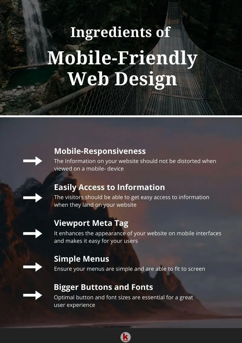
Mobile-Responsiveness
It means that irrespective of the fact from where your website is accessed, your website shows up complete information and is not distorted. Yes, the arrangement of various elements does change or adjusts to the screen size but the information is not hit. This is no longer just to please your audience but also the Google algorithms that no longer rate websites that aren’t optimized for mobile.
Information Should Come Easy
You have put in a lot of effort to address the main pain-points of your audience and give them the best solutions in your niche, yet your web design does not let your visitors reach that information with ease. They have to follow a series of steps to reach something relevant on mobile interfaces. This experience can be actually frustrating and in fact, lead to an increased bounce rate. Mobile means on the go and it stands to represent speed. People want information at the speed of thought. No wonder the digital assistants are becoming popular as they handle the commands with voice, saving time and effort. Imagine if you are looking for something urgent while traveling and the website just forces you to literally stop and search to get to the information! It will have not just marred your experience, but also forced breaks on your thoughts and also your pace. It is an online world and it is full of options. So, you switch instead of stopping. It is not that everything should be on the front page but the navigation should not be taxing or difficult.
Viewport Meta Tag
It enhances the appearance of your website on mobile interfaces. This tag makes the browsers to match the screen size of the device. It is an easy way to control the way your website will appear in mobile browsers and saves you from the uneasy scrolling to get to the right content. It is not very difficult to add this to the HTML and can be done by simply pasting it in the HTML.
Button Sizes
Having small buttons can be quite a turn-off on a mobile interface. It can become worse if there are multiple buttons that have to be clicked. Imagine pressing one while pressing another can get really annoying. This can be handled by giving your visitors an optimized mobile experience by using buttons of a bigger size.
Bigger Fonts
Remember, it is all about user experience and every single point matters. As with small buttons, even the size of fonts can get heavy if they are too tiny. It is recommended that you should use a font of at least 14px for mobile optimization. Another vital takeaway is that preference should be given only to standard fonts. Your visitors should not have to download any fonts to browse your website. It will simply kill the mobile experience.
Simple Menus
When you are designing a website for mobile experience you need to remember that the screen size is way smaller than laptops or desktops. Hence having elaborate menus can be cumbersome to handle on such screen sizes. If the users have to scroll and zoom in to find out to read the navigation choices, it is again a great put-off. Hence, make sure your menus should be simple and be able to fit on the screen without the need to scroll.
Having your website optimized for mobile users will directly put you ahead of the curve and put you in the sphere where most of the internet traffic lives. Mobile optimization will require you to have a clear understanding of the design principles. Simple menus, large fonts, and buttons, use of white space, ease of navigation are some of the essentials of the mobile design. Loading time is another point that has to be addressed. Remember, mobile means speed and experience in perfect harmony. Mobile defines the future and if you want your business to be a part of it, act now!


Leave your comments
Post comment as a guest