Webspace is growing by the day. Many latest reports have recorded a total of over 4.66 billion active web users.
We cannot deny the fact that the world is increasingly shifting online. And a huge rise in this is due to the humongous growth seen in mobile platforms.
Yes, mobile alone accounts for nearly 52.2% of the total web page views. This is big and growing. Mobile phones, as we have seen them evolve from the keyed versions to the ones only with screens.
The entry of smartphones into the scene has changed the whole dynamics of the web. There was a huge surge in the number of people who can now access the Internet and that too on the go. The web on mobile became the best mate. Then came the apps that made the game tougher at least for the businesses. Here, success took a backseat and survival became a priority. Businesses were shaken off their feet for they had to constantly innovate to keep pace.
One thing that was driving the whole show was the customer expectation, that peaked. Yes, it still remains, fixated at the zenith. The growth in online populations has come with an equal rise in the number of websites and apps. So what does that mean?
For a customer, it means choice while for businesses it only means competition.
It was this growth in customer expectations and the constant fight to provide smooth user experience has the need for a responsive web design cropped up.
So, What is a Responsive Web Design?
In simple words, it is a website design that responds to different screen sizes to bring the perfect user experience. It became vital for the survival of businesses with the growing use of smartphones, tablets and other handhelds alongside the usual desktops and notebooks. Any business with a digital presence cannot dare to overlook the mobile audience. For some, this is where website design agencies can be immensely helpful.
And, yes the Mobile-First Index announced by Google in April 2018 is another vital consideration that enhances the need for web designs to be responsive.
Unlike a traditional website design that came only with the typical three-column design, the new responsive website design is different. While the latter presented a challenging view on mobile devices as the three columns often took a horizontal spread that was hard to read due to skewness or distortion. Also, many large images completely broke the layout on small screens. Not to forget the loading times.
All this is completely handled in responsive web designs as they adjust to the screen sizes and display the content accordingly. Content navigation and readability become easy. Images readjust accordingly instead of distortions.
This is made possible as these designs are supported by fluid grids wherein the page elements are sized as per the proportion than by pixels.
Benefits of Responsive Web Designs
The idea is not to write a detailed responsive web design tutorial but to quickly walk you through the benefits that are linked with responsive designs.
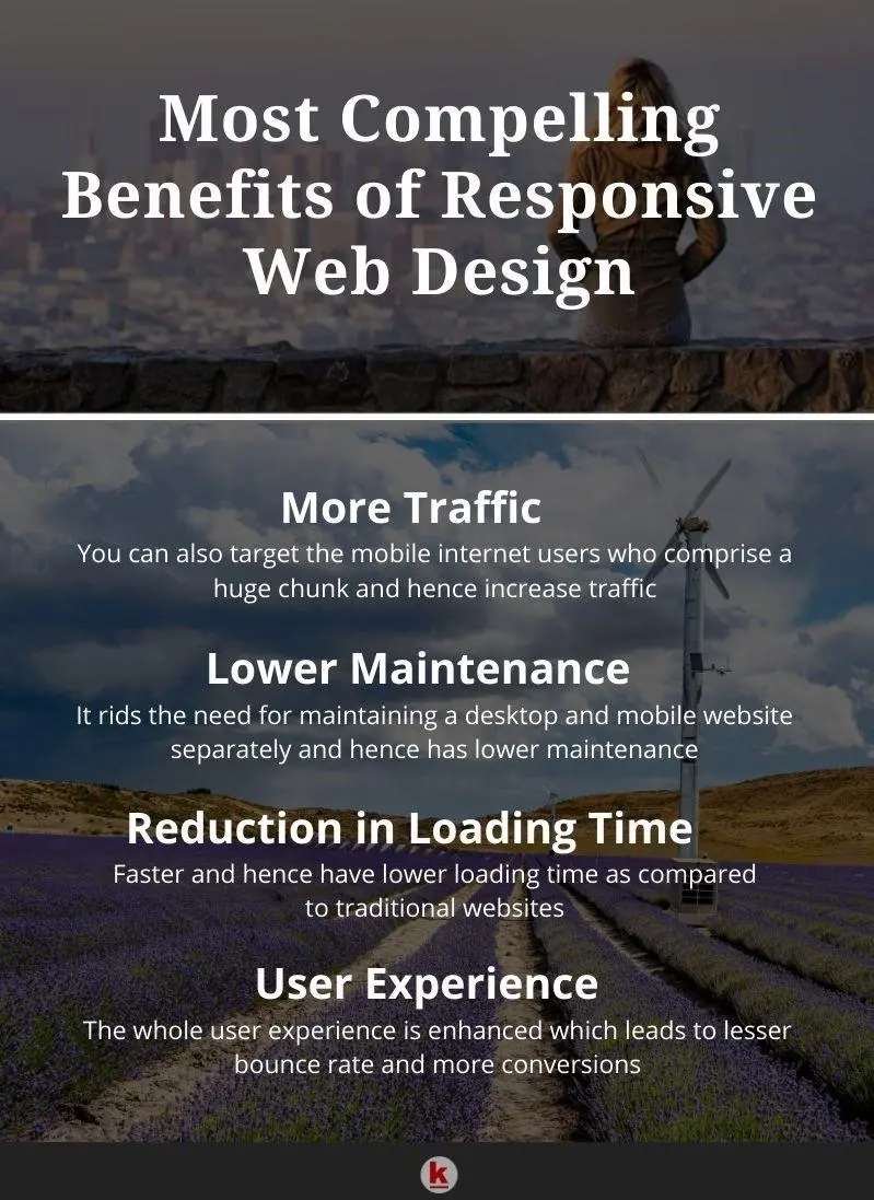
- More Traffic: When you are running a business in digital space, then you work with one motive of getting more traffic. And, when you know that a majority of internet users are on mobiles then you cannot keep yourself away from that pool. Hence, the need for a website that is responsive to the mobile platform cannot be ignored. It's not just the presence but also the experience they get on mobile platforms that will make the difference.
- Lower Maintenance: You can imagine the costs and resources required to maintain a separate website for mobile and desktop usage. You will not only need separate testing and support systems but might also need a dedicated content strategy for each of these. Contrarily, a responsive design calls for standardization in testing and also optimal web layout on every screen. Hence the maintenance time and labor come down and one can focus more on other vital aspects.
- Reduced Loading Time: Heavy website designs not fit to be supported by small screens often take a huge loading time. We all know with the growth in options and the pace of life, the attention spans of the visitors have fallen. It is only a matter of fewer than 8 seconds that you have to catch the attention of your visitor. Those highly important moments if are lost merely in loading, then you have already lost the show no matter what product or what offer you are rolling out.
- User Experience: This is the name of the final end-game and it has stood tall in many circumstances. Everything is ultimately aimed at a smooth and fantastic user experience. This brings down bounce rates and of course, adds to conversions. Remember, one who visits your website does not want to spend time learning to use it.
Responsive Web designs stand out in the world where people are running out of time and want their solutions served without any effort. Remember, there is no dearth of options. The web will continue to grow and with the influx of technologies like AI, AR, and VR, things are bound to change. If you are thinking that you have reached the edge of web design, then it might surprise you that this might just be in the infancy stages. What is yet to come may not have been realized. One thing is certain in this change, that the responsive website design is here to stay.


Leave your comments
Post comment as a guest